Blog

The Artwork of Shawn Falchetti
My Heart d'Aches for You

Every now and then at work a little windfall comes my way in the form of an Amazon gift card.  The beauty of gift cards is that you're expected to get something you want, but not necessarily need, so your purchases are guilt free.  It's part of the same line of reasoning that reduces the calories of all foods consumed on my birthday to zero. Today, exactly 2 days since I clicked the "Checkout Now" button, the brown Amazon smiley face box arrived on my doorstep.  I eagerly took it inside to the counter and cut open the sealing tape.  A brushed metallic tin gleamed out from the bottom of the box.

Confession: before I show the tin, I should say that the gift card (which was generous!) didn't quite cover the purchase price of what I wanted.  So, I splurged a bit.  Okay, quite a bit.....but did I mention that I really wanted it?

Back to the box.  I lifted out the tin, and....

IMG_2370

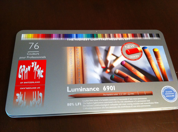
...a full set of Caran d'ache Luminance pencils!  Cue the Barry White music as I opened the tin:

IMG_2372 
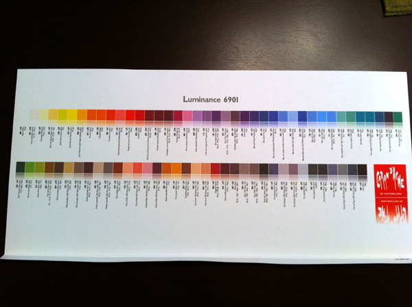
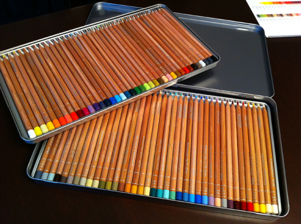
The Luminance pencils really are exquisite.  I've been purchasing the flesh tone colors open stock and using them in my pieces for a while now.  The pencils have a nice natural wood casing with silver text printed on them, and this set had a little sticker on it calling out the improvement of the colored ends so you can tell what color a pencil is at a glance.  Another nice touch:  although both pencil trays are plastic, the upper one sits in a removable metal tin so you can lift it out without the pencils spilling everywhere. What's interesting about the 76 color set is that it's really ideal for drawing people.  It comes with a nice paper insert with all of the colors shown:

IMG_2373

I'm really looking forward to drawing with my Luminance pencils.  At $4 a pencil I'm a little scared to sharpen them, but I'm sure I'll get over it.

CPSA Silent Auction

Each year the CPSA holds a silent auction during convention week at the Annual International Exhibition.  If you get a chance to go, be sure to attend Thursday night of convention week.  It's a fun night where you get to see all of the entries, get some great door prizes, and bid on the auction.  The auction quickly escalates into a frenzy of last minute bids as everyone tries to get his favorite piece. I was one of the invited artists this year to contribute a piece to the silent auction.  Auction pieces have a  size limitation of 11" x 14" matted so that everyone can take their piece home in a suitcase; also, because the auction is called "Small Works of Great Magnitude".

My piece for this year's auction is titled "Kiersten", and was completed with Prismacolor Premier, Caran d'ache Luminance, and Lyra colored pencils on Light Blue Canson Mi-Teintes Touch paper.  I really love the color of the Mi-Teintes Touch paper, and matted the piece with 3/4" of bare paper.  If you like it, you can bid on it on the CPSA show Thursday night, 8/1.

Kiersten CPSA Auction

Drawing Magazine

The Spring issue of Drawing Magazine includes an article on drawing materials. My work, "Cascade", appears in the article on page 64 (full page!). Also in the article are two works by Cecile Baird, and later in the issue is a great article about Joseph Crone, who won the magazine's Shades of Gray competition. Be sure to grab an issue and check it out! IMG_2164

Big and Small

I received a gift card from Kiersten's parents for my birthday which I merrily used to purchase a cornucopia of art supplies.  Today the instant message chirp sounded from my phone letting me know that Amazon had delivered my package.  Somehow the Fedex guy is part ninja and always stealthily advances to my front porch to deposit a box while I'm home without me noticing, and 4 seconds later the only trace of his passage is the text message Amazon sends my iPhone confirming delivery.  I passed through the series of gates that form the baby airlock to the front porch, gleefully scooped up the plain brown box, rushed to the kitchen island to tear it open, and begin unloading my loot.  Snuggled in amidst packages of replacement Xacto blades was the centerpiece of the order, my new electric pencil sharpener. I have to admit that finding a worthwhile pencil sharpener is a real quest for a colored pencil artist.  Colored pencils require a constant super sharp point to function properly, and the wax binder tends to gunk up all the blades and gears of most very quickly.  I had an Xacto model that I loved which lasted years, and when it retired I was pleased to find the exact same model in my local hardware store.  Now that the replacement needs replacing, I've eyed up something a little more heavy duty.

As I unpacked the new Swingline model and set it beside my old Xacto model, I couldn't help but think it was the pencil sharpener version of the Crocodile Dundee "That's not a knife" scene.  I'll show you what I mean:

sharpener

That is one big pencil sharpener.  You carry it with two hands like you would a vase. It has its own pencil holding pouch in the back, you know, in case it gets hungry because you're taking too long between sharpenings.  The red disc rotates pencil size openings so I can finally fit my Caran d'ache Luminance pencils in without feeling like I'm driving a tent stake into the ground.  Time will tell how it fares against the wax binder buildup test.

Setting aside the sharpener for a moment, I moved to the other end of the size spectrum.  I wrote a post a while ago about my conversion to a Macbook Air as my main computer, and some of the challenges of its lean 128 GB solid state drive.  It's amazing how quickly photos and videos start filling that up.  Equally amazing is how small and cheap flash drives have become.  In my box of art goodies was a 32 GB low profile flash drive which snapped into the USB port of my Air, instantly increasing my storage space by 25%.  My reaction to seeing it was similar to my pencil sharpener, just opposite in scale, because the entire thing balanced on my fingertip.  When plugged in, only the black part sticks out, and you barely notice it's there.  Pretty neat!

flash computer

flash 2

The Artist's Magazine

I just received my May 2013 issue of the Artist's Magazine.  Starting on page 48 is an article by Maureen Bloomfield, "Colored Pencil Comes of Age", which details the work of Joseph Crone (www.josephcroneart.com), John Smolko (www.smolkoart.com), Arlene Steinberg (www.arlenesteinberg.com), and.....drum roll please...me!  My article appears on page 56-57 and includes my works, "Bend", "Unfurled", "Cascade", and "Opaline Dreams".  It's very cool to see the article as a whole, because each of us has a very different approach and look: Joseph's black and white film noir works on acetate; John's energetic, expressive lines on Mi-Teintes; Arlene's colorful realism on Icarus board heated paper, and my speckled drawings on textured paper.  I'm friends with Arlene and John and admire their work, and I look forward to meeting Joseph at one of the CPSA conventions, so it's great company to be in for the article. Artists Magazine May Cover

It was interesting seeing the article go through its revisions from initial layout to final proof, since Maureen sent us updates at different stages for proof reading.  One of the challenges was preparing my digital images so they accurately translated into print.  The Artist's Magazine sends you a nice guide for this - what dpi and color space to save images, use of color guides such as Kodak Q13 in photos.  I followed it nicely for the main images, but didn't quite get it right for the progression of Opaline Dreams, so the final image is very dark. Oops! You can see the normal exposure on my portfolio page.

IMG_2086

iArt

I just celebrated my 42nd birthday last week, and was thinking back to the pre-internet days of my youth.  I remember in college when we were given the option for the first time of writing a paper or creating a webpage.  Soon after I marveled as the robotic arm in our engineering lab came alive one night, reached over and grabbed a paintbrush, dipped it into some blue paint, and began painting waves on a nearby canvas.  A little webcam taped to it was allowing people to control it over the Internet as part of the PUMA Paint project.  People I'd never met from countries I'd never been to were painting pictures in a room that contained only me and a robot. Now, hop into your DeLorean, charge the flux capacitor, and jump to present day.  No flying cars, but the Internet is ubiquitous, and it's all about connecting you with people.  As an artist, you probably have a blog, a portfolio web page, a personal Facebook page, possibly an artist's Facebook page, an Etsy shop, a Pinterest profile, and maybe a Twitter account.  Keeping up with everything can be a challenge.

Ratchet that challenge up to level 2 by thinking about what people are using to read your online media: laptop, iPad, iPhone, Android tablet, Kindle Fire?  What looks great on your desktop monitor might be unreadable on a cell phone screen, and your Flash based online gallery won't work at all on an iPad.  Since more and more people are surfing the net from tablets and smartphones, it's easy to unintentionally block out some of your audience.  I spent the past week fixing this for my sites.  Here's the main changes:

Provided an alternative to Flash and touch navigation for tablets:

When Apple launched the iPhone and iPad, they decided to not support Flash.  My portfolio web page uses a Flash based program called SlideshowPro to display my artwork.  This week I upgraded it to a version which has different galleries depending on what device a visitor is using:  a fancy Flash gallery for computer users; a HTML5 touch screen gallery for those with iPads or tablets.

Changed the porfolio web page to resize itself based on the visitor's screen size:

For those savvy to CSS, I changed my page layout and image sizes from fixed to fluid.  Everything scales to consistently fit on a viewer's screen regardless of how big or small the screen is.  This is particularly handy for iPads and iPhones, which have portrait and landscape modes:

Two small changes, but now everything is iPad/Kindle/smartphone friendly.  A little food for thought if you manage your own web pages.

IMG_2078


IMG_2077

Sue Obaza - Visions and Dreams

Today I stopped by Something Special in Kingston for Susan Obaza's artist's reception, "Visions and Dreams".  It was great to see Sue again - she's been one of my favorite colored pencil artists since I first saw her work at a CPSA DC115 show in 2003.  Her work has appeared in North Light Books Strokes of Genius 2, and she has a mastery for making the texture of Canson Mi-Teintes paper sing with colored pencil.  She also organized and led our local life drawing group, which Kiersten and I used to regularly attend. Sue's show, "Vision and Dreams" is very original and quite cool.  Each of her pieces is a mix of elements - colored pencil drawing on paper, fabric collage, stained glass and mirrors - each framed in ornate mirror frames.  Sue told me she is a hippie at heart, and was going for a hippie vibe.  Some of the pieces reminded me a bit of Tarot cards with their surreal figures and linear elements from the stained glass channels, while others were surreal landscapes.

Her show runs throughout the month at Something Special.  Be sure to check it out!

IMG_2067


Emma 1.0

Just a little more than a year ago, I had a very remarkable President's Day.  It started at 4 am with my wife, who was 9 months pregnant at the time, nudging me awake.  It ended in a hospital room with Kiersten in her bed, me in a recliner, and a small, beautiful six pound baby girl swaddled snoozing in a cart between us.  We named her Emma. IMG_1340

I wrote this in my original post about our first week home:

The past 7 days have been a single, long, wonderful day.  Day and night have blurred together; quiet times and crying times, sleepy times and cuddling times, lots of diapers and burpings, and mom and dad promising to take a nap themselves, always tomorrow.

In many ways, the past year feels like that first week.  The days have blurred together and sped right along, and it's hard to believe that same small, swaddled baby is now standing up and pushing buttons on her activity table, turning pages on books as we read them to her, stealing the tv remote, and looking very much like a little girl.

IMG_1483   IMG_1720   IMG_5014


This upcoming weekend is Emma's 1st birthday party, complete with a theme (jungle animals!) and a small smash cake for her to demolish.  I'm really looking forward to it!  It's also put me in a retrospective mood thinking about the past year, and the changes that came with it.

One of the many perks of having a baby is that you get to redefine what is meant by normal adult behavior. Case in point:

Earlier today I was lying on the kitchen floor, on my back, with my feet up on the garbage can lid. Pre-baby, this probably would have been cause for concern for my wife,  but with Emma merrily pushing her blocks around my head and occasionally stopping to grab my nose, it seemed the place to be.

This really extends to the whole range of activities you probably haven't done since you were a child: lying on your stomach playing with blocks while Saturday morning cartoons are on; reading rhyming Dr. Seuss books; actually making the animal sounds ("moo!") or the train sounds ("choo choo!") when you read them aloud; making raspberry sounds with your lips and funny faces just because it's silly - all perfectly fine when you're doing them with your toddler.  Having a kid renews your license to be a kid.

It's also fun that this is contagious.  Emma has an assortment of blocks, disks, and rings to stack.  Right now she likes to take them apart much more than put them together.  Any adult who visits and finds himself in front of them for a length of time will unknowingly begin to assemble them.  Colorful blocks with holes, the pegged wooden framework of a train waiting to be complete - it's irresistible.

But, aside from rejuvenating your inner child, having a child also makes you want to stretch your grown up side, too.  You'll want to be better than your pre-baby self - a better teacher and example, more patient, more flexible, and just an all around more grown up version of yourself.  But, interestingly enough, you'll do this all while being more of a kid than you've been in years.

I considered writing about all of the wonderful ways things that have changed, but I realized I didn't have the words - I'm not sure how to sum up the joy of spending a weekend playing on the floor with Emma and Kiersten, making airplane sounds while spooning baby food as the three of us eat dinner together as a family, hearing Emma's laugh, seeing her excitement when she discovers something new, or just watching her turn pages as I read a book to her at the end of the day - so I've written just a few musings for today.  Now, I've got some birthday party tables and chairs to set up!

Jumping Ship

After 7 years of writing my art blog using Wordpress hosted by GoDaddy, I've jumped ship and switched over to Google Blogger.  The main difference you'll see is just the address:

Old Address www.shawnfalchetti.com/wordpress

New Address shawnfalchetti.blogspot.com

All of the content was migrated over, and I was even able to find the same notebook theme so that visually the site looks about the same.  The only thing that seems to have not made the transition were comments.

Why the move?  To be honest, I'm unsure if it's the latest Wordpress update, GoDaddy's issue, or something that's broken on one of the Wordpress plugins I have installed, but my site has ground to a snail's pace.  Load times for posts were > 30 seconds.  With enough technical effort I probably could figure out what was broken - but that's just it - I always seem to be troubleshooting.  Wordpress is a terrific blogging platform with infinite customizability, but that complexity makes it easy to break things.  I have a whole series of Woes of the Web posts where the latest Wordpress upgrade has resulted in my blog going offline for a week.

So, here's a few of the pros and cons I've seen between the two platforms:

Wordpress:

PROS:

  1. Free, but may require a web host:  You have two options: 1) download the program for free from Wordpress.org and install it on your website.  In this case, you are likely paying a company like GoDaddy a monthly fee for the website; or 2) create a free blog on Wordpress.com.
  2. Highly Customizable: Thousands of themes and plugins are available on the Internet for free.  Themes define the appearance of your blog.  Plugins add features to your blog, such as a guest book or connectivity to social sites like Facebook.
  3. Elegant Interface:  Writing in Wordpress is liking writing in Microsoft Word.
  4. Free upgrades: People are constantly adding more features to Wordpress.  Every few months a free upgrade rolls through.

CONS:

  1. Complex:  Sometimes all of the customizations don't play well together, locking up your blog or otherwise creating errors.  It can be very difficult to troubleshoot, and you may need to even dive into computer code.
  2. Difficult for you to create a custom appearance, unless you are fluent in CSS and PHP:  If you can find a theme someone else has made which looks like what you want, great; if you can't, making one yourself requires computer knowledge (PHP programming) that the average person doesn't have.
  3. No community if self installed.  There's no "Followers" feature like Google has, although there are some plugins that integrate Facebook likes.

Google Blogger:

PROS:

  1. Free, period:  It takes 10 minutes to go to the Google Blogger website and make a blog.  There is no cost, and you do not need a website provider.
  2. Simple:  Basic interface, and limited choices for themes and gadgets.  The focus is on blogging, rather than bells and whistles.
  3. Easy to customize:  The dozen or so themes built in to blogger are very easy to customize.  There are sliders for easily adjusting column widths, color pick boxes for changing font colors, and drag and drop layout editors for changing where elements appear on the screens.  With a little tinkering you can take a basic template and make it look quite flashy in just a few minutes.
  4. Community:  Everything is integrated into your Google Profile.  If you have blogs you already follow, they show up in your link list automatically.  Other people with Google profiles can follow you, Facebook style.  A web ring is automatically created that allows people to move between blogs of friends.

CONS:

  1. Limited customization:  The list of available Google Gadgets is small compared to the giant list of Wordpress plugins.  Many of the fancy add ons you may be used to with Wordpress just don't exist for Google.
  1. Somewhat limited themes:  There are external sites which have free themes to download, similar to Wordpress, but the vast sea of Wordpress themes does not exist for Google.  In general, your best bet seems to be using the built in themes and their customization features.

Well, this is my first post on Google Blogger.  More to come!

MusingsS.D. FalchettiComment
Merry Christmas 2012

A jazzy version of "White Christmas" is playing on the stereo as I type this, sitting by the glow of our Christmas tree.  It's just a small Charlie Brown tree, but it's filled with ornaments given to us by our family, and lots of love.  Usually we shuffle around the furniture in the dining room to set it atop one of the cabinets, but this year the dining room has been overrun with bouncer seats and play gyms, so it caused us to do something we've wanted for a while now - set it up in the living room.  I snapped a picture of Kiersten, Emma, and Iggly all hanging out together by the light of the tree.

This year there are two new ornaments - one from each of our families celebrating Emma's first Christmas.


Merry Christmas!

Colored Pencil Magazine

The December issue of Colored Pencil Magazine features a four page article by me!  I walk through the process of creating Daydreams with WIP photos, then talk about the proofing process of working with a gallery to professionally scan and reproduce the work to create prints.  I'm excited to be included in CP Magazine - be sure to check out their website if you're interested in buying an issue.  Here are some images of two of the article's pages:  

Strokes of Genius 4

I received my copy of North Light Books Strokes of Genius 4. My piece, Daydreams, appears on page 86 in the Figures section. I love the Strokes of Genius books, so it's awesome to appear in one - plus some of my favorite colored pencil artists have work in the book as well. Strokes 4 Cover


Strokes4_shawn falchetti

NewsS.D. FalchettiComment
Somewhere, Out There

...beneath a pale blue sky.  Okay, I'll stop my Fievel song (Linda Rondstadt and James Ingram, anyone?), and get back to typing.  Colored Pencil Magazine posted a tip about how to use Google Images to locate your artwork on the web (go to Google, click on images, click on the camera icon, and upload one of your images.  It will show you all the websites with that image).  I've done text searches before which have ranged from interesting (my artwork was used for the Strokes of Genius 4 blurb on the Artist's Network site) to downright hysterical (like when my wife and I googled our last names and found her's was famous for The Wilhelm Scream, and mine always found this somewhat PG-13 music video).  So, of course, I was really curious what an image search would find. The image search was for "Opaline Dreams", and the first hit was this article on the Russian blog, Look at Me.  Google happily translated it into English, and it is actually quite a nice article on four artists.  One of the funny things is how Google Translate tackled the quote from my artist's statement, which went from English to Russian back to English again.  My original statement was:

The relationship between light and mood has always fascinated me. There’s an inherent drama to a high contrast figure bathed in sunlight, while a quiet, diffused interior has a lazy, colorful atmosphere which suggests what’s behind the scenes has a whole life of its own. I find what's behind the scenes and tucked into the shadows is far more interesting than what routinely gets the spotlight.

and Google's translation became:

I have always been interested in the relationship between light and mood. In sunny silnokontrastnoy figure is a drama, and a lazy atmosphere shaky night for the peace and quiet - a lifetime. Drags me that behind the scenes, what is hiding in the shadows

I'm kind of digging it in a poetic kind of way.

Next up was "Haven".  What was cool about "Haven" was not where the art was (which was only on my site); it was the image that got matched with it.  Here's Haven:

and here's the picture that Google matched with it, which comes from the blog of Karinne Ribeiro.  Neat!

Next up was "Hopes and Dreams", which, not surprisingly, found a whole bunch of pregnant women on the internet.  Last up was "Cascade".  Here's the actual Google result of images scattered across the internet which are visually similar to "Cascade":

It's all my stuff!  My stuff, it turns out, looks like my stuff.  My favorite photo in that bunch are the two jack-o-lanterns....which are also mine (well, the one on the left is, at least.  Kiersten gets credit for the one on the right.)  Apparently I use the same visual approach to pumpkin carving that I do to colored pencil drawing.  Which is the perfect segue way into the post I'll write this weekend (hmmm...can you guess what it will be?  I'll give you a hint: it will be visually similar to the group above).

Bedazzled

I remember my first computer, a little, square, black, magazine sized block called the Timex Sinclair 1000.  It was 1982, it sold for $99, it had 2 kb memory (that's right, kilobytes), a quite respectable 3.25 Mhz operating speed, and, this is my favorite part, a resolution of 22 x 32 text characters.  It was made by Timex - you know, the watch company ("Takes a lickin' and keeps on tickin'!), and Sinclair - okay, I have no idea what else they made, aside from this.  Sporting a flat membrane keyboard, the entire thing was fairly solid with no moving parts. At the time I thought it was the bee's knees. Last year when I was sifting through some storage boxes, I found my cell phone from 1997.  Like my buddy the Timex-Sinclair, it also was a black brick with a black and white display.  It had a nifty button top walkie-talkie plastic telescoping antenna for better reception.  I always suspected it was a technological placebo to make me think I had better reception, because I couldn't quite understand how a completely plastic antenna was picking up anything.  Crumpled up next to my 1997 sidekick was a piece of leather origami which sprang into the shape of the phone as I prodded it.  Windowed cutouts allowed the screen and keys to poke through.  It was perforated with a stylish hole pattern like you would find on the leather wrapped steering wheel of a sports car - you know, to let it breathe.  Aside from keeping my plastic brick snug and cozy, it's 0.2 mm of thickness served no other appreciable function.  Besides, you could fight off a bear with that phone without denting it.

So, this leads me to last week, when I found myself shopping for two tech accessories:  a case for my iPhone, and a case for my snazzy new Macbook Air.  The iPhone is the model with the metal sides that form the antenna, and the shiny glass back and front.  As anyone knows who grew up holding rabbit ear antennas on TVs to improve the reception, you become part of the equation when you touch the antenna.  To avoid you messing up your own cell phone signal, you need a case.  Plus, a phone made of glass is somewhat subject to breakage.  The MacBook Air, on the other hand, is not made of glass, but instead has a beautiful brushed aluminum unibody shell.  Its problem is scratches and dents, and it too needs some loving.

I was thinking about my phone, which, with its 8 GB of flash memory can store the contents of 4 million Timex-Sinclair 1000s, and my 1997 cellphone.  30 years of progress has evolved devices from indestructible bricks with cases for looks to elegant glass and aluminum works of art with cases required to function.  There's definitely a side commentary on the trade-offs of art versus form and function.

As I scrolled through endless webpages of iPhone and Mac cases I saw it all: rhinestone encrusted cases, chrome cases, matte black cases with giant alien heads screen printed on them, Hello Kitty cases, glow in the dark cases, and the complete Michael Kors collection of cases on the Apple store.  On the other end of the spectrum were rubber encasements suitable for industrial use.  Is there no midpoint between bedazzled and basic?

Finally, after all my searching, I came up with something which simultaneously went against and with all of my artistic instincts: clear.  My MacBook Air has a nice, thin, clear snap-on case (Moshi iGlaze) which lets me see all of the beautiful brushed aluminum, as does my iPhone.  I think the analogy is picking out a frame for your artwork: sometimes it's tempting to pick out a frame to make the art prettier - but maybe letting the art speak on its own is the way to go.

Happy Fall 2012

Every year we snap a picture of the tree in our backyard when it turns a brilliant gold during fall.  This morning the sun was hitting it just right and it was radiant:

Macbook Air

Not too long ago I wrote a post about my trusty, 6 year old Macbook Pro, and the many technical surgeries to fix its ailing parts.  Six years is ancient as far as laptops go, and it's a testament to just how good that line of computers is that I've had it this long.  I use my laptop heavily - not just for rambling blog posts, but also for photo editing and as part of my art process.  One of the things I loved about my Macbook Pro was its brushed metal body.  It felt indestructible.  It also felt like a set of gym weights sitting on my lap.  As I thought about next computers, the appeal of portability started to weigh as heavily (perhaps even more so) than tech specs. I would love to have an iPad.  I keep making up mental excuses for why I would need one.  But, in reality, the programs I use just don't exist as iPad apps.  There's photo apps, sure, but you can't yet run the full version of Photoshop, Dreamweaver, or Aperture on a iPad.  If only there was something as thin as an iPad, but capable of running all my favorite programs.  Enter my new toy: the Macbook Air.

Remember the ads for these when they launched in 2008?  A hand reaches down and opens up a manilla envelope, then pulls out an impossibly thin laptop. And that was 2008.  Imagine what the 2012 model looks like.  Well, no need to imagine...here's a picture!

Last week Kiersten was talking about how she's gotten so used to lifting up Emma, who's now around 15 pounds, that when she reaches down to scoop up our cat, Iggly, she overcompensates and launches him into space.  I've had a similar experience adjusting from picking up my old Macbook Pro to picking up the Air.  It looks like I'm hamming it up like an actor from a 70's sitcom, juggling the computer and briefly spazzing out for no apparent reason other than to give the studio audience a laugh.  Fortunately, the studio audience is busy prying the cat off the ceiling from the recent space launch attempt.

Aside from the lightness, one of the other big differences is that the Air has no hard disk drive; instead, it has a solid state drive.  That means instead of a drive that spins and whirrs, it's all flash memory.  The computer is utterly silent when on, and instantly accesses programs and files.  There is a downside, though - my fancy SSD is only 128 gb.  It's actually a downgrade in size from my Macbook Pro (which was 180 gb).  So, this had made me completely rethink how and what I store on my computer.

For being such a technology geek (hey, I am an engineer, after all), I've been slow to embrace the Cloud (files which are stored and accessed over the Internet, via services like Apples iCloud, for instance).  There's something about not having your files in your possession that makes me a little uneasy.  But it's everywhere now.  If you buy a Kindle Fire tablet, it has very little storage.  All those movies and songs are accessed via Amazon's cloud and streamed on demand.  I realized that much of my storage space was being eaten up by things like my iTunes library (which I've imported every CD I've ever owned into).  It turns out, for about $2 per month, you can move your entire music library to the iTunes cloud, stream it on demand, and re-download it anytime you want.  This has freed up a ton of space.

Anyhow, just some tech ramblings as I slowly give up some tried and true technologies and migrate into somewhat unfamiliar territory.  And, of course, continue to admire just how cool the new Air is (here's a few more pics)!

The Mystery Continues

The last few drawings of mine have ended in small disasters.  After spraying the piece with a moderate coat of Krylon Workable Fixative (which I've been using for years), I've scratched my head and wondered if a gremlin had snuck in, grabbed a red pencil, and run amok on the picture:  an intense, reddish purple had appeared in multiple areas. Since this has occurred in skin tones and hair, I suspected one of the reddish browns was reacting with the fixative and bleeding.  Fixative is part solvent, after all. I slipped on my lab coat (figuratively) and decided to conduct an experiment with a before and after fixative scan. As it turns out, none of my suspects were guilty.  None bled as a result of the fixative.  But - I've always known that my colors darken as a result of applying fixative, so I thought it would be interesting to set the results side by side to see just how much.  The swatches are on Canson Wineless Mi-Teintes Touch paper (my new favorite color!), and the pencils are Prismas (because that's the main brand I use):

You can see all of the colors darken noticeably, with Nectar and English Red having the least change.  Some of the colors, like Pink, both darken and allow more of the paper color to show through.  Something to keep in mind when applying fixative.