Shawn Falchetti, CPSA

Blog

The Artwork of Shawn Falchetti
Posts in Musings
Twists and Turns

If you've attended the CPSA Annual International Exhibition, you've experienced the lull on Saturday after the morning trade show but before the late afternoon artist's reception. It's a good time to group up with friends for lunch at a local eatery. A few years ago I was wandering past the convention's conference room on the way to my hotel room when I heard some familiar voices. Peering inside the entrance, I saw a round table of listeners with Elizabeth Patterson speaking. She was telling the story of her career, with all of the twists and turns that led her to where she was today. It was fascinating, a mixture of hard work and sometimes being in the right place at the right time. Lately I've been working on a non-art related bucket list project: writing. If you've read my blog, this shouldn't come as too much of a surprise, because I do love to write. But, it's been overwhelming trying to determine where to start, so I thought I'd look at how things progressed with my art career.

There's a popular meme which compares plan versus reality. It shows the plan as a straight line connecting two dots. Reality is a spaghetti-like connection. That seems accurate:

  • 1999: I live in a small apartment, and search for something less messy than oil paints. I discover Ann Kullberg's Colored Pencil Portraits Step by Step, and I'm awed at what colored pencils can produce. I buy a 120 pencil set of Prismacolors and a few sheets of Stonehenge paper.
  • 2000 - 2003: I complete a few portraits for friends using Ann Kullberg's techniques.
  • 2004: A local book shop hosts the Pennsylvania CPSA chapter DC115's member show. I happen to be at the book shop perusing art books, and meet MaryBeth Lesko, DC115 president. I join CPSA. When they have their first member show, I am nervous about dropping my artwork off for the show because I'm worried it isn't good enough to display. I take a workshop led by Jeffrey Smart Baisden.
  • 2005, 2006: I submit pieces to the Annual International Exhibition, but they aren't accepted. I peruse the online art forum, Wet Canvas, and discover some members are on a pencil drawing website called ScribbleTalk. I join it. As I produce more work, I begin posting it for feedback on ScribbleTalk. It also opens my eyes to many different types of supports and approaches. I discover textured paper (Colourfix) after seeing Nicole Caulfield's work on Scribbletalk (thanks, Nicole!).
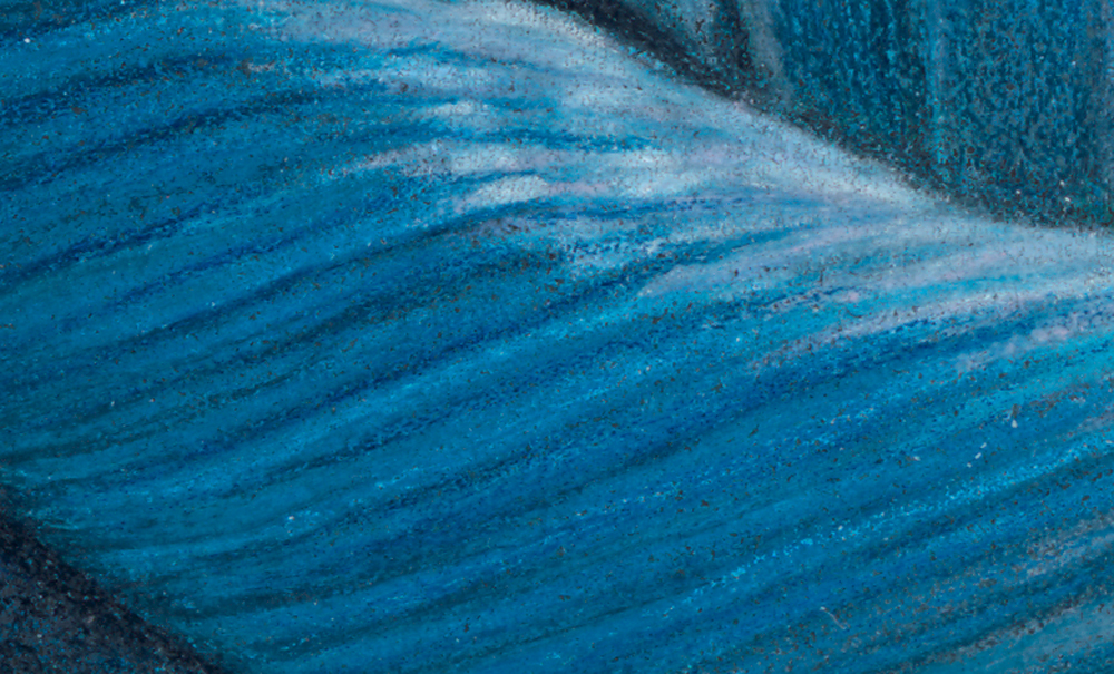
  • 2006: My first work on textured paper, Blue Nude, is accepted into CPSA Explore This! 4. During this same year I notice many of the people on ScribbleTalk have Wordpress blogs, so I create a blog and start posting work.
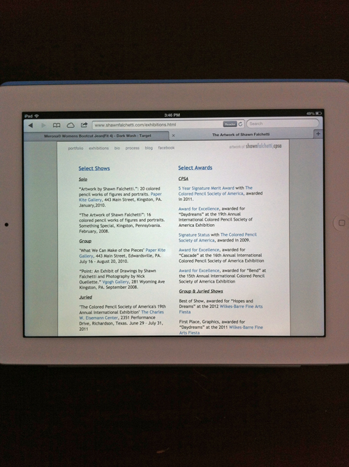
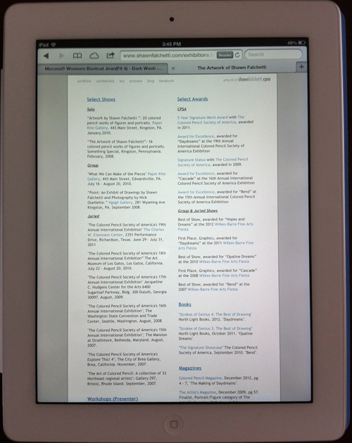
  • 2007: My first acceptance to the CPSA Annual International Exhibition. I'm incredibly excited. It's a major goal of mine to get a piece into the annual show. It's my first time meeting many of the ScribbleTalkers in person. I find a local scanner/printer, Lizza Studios, and begin selling prints of my work directly from my website. I notice some of the ScribbleTalkers are using Neocolor II crayons (thanks, Ranjini!), and experiment with them.
  • 2008: After a DC115 group show, the gallery owner offers me a solo show. I sell my first original. My second acceptance in the Annual International show. I lead my first workshop as an instructor, and give a talk at my local art league.
  • 2009: Signature Status for my third CPSA acceptance. The same piece, Crescendo, is a finalist in the Artist's Magazine Annual Competition.
  • 2010: Second solo show, at Paper Kite Gallery. In a conversation with CPSA DC115 member, Susan Obaza, she asks why I don't submit to the Strokes of Genius books. I start submitting the following year. I create a Facebook page for my art.
  • 2011: 5 year merit award with CPSA. Opaline Dreams appears in Strokes of Genius 3. Somewhere near this time CPSA excludes Neocolors from the annual show, and I need to adjust my approach to work without them.
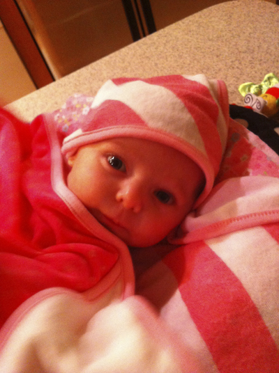
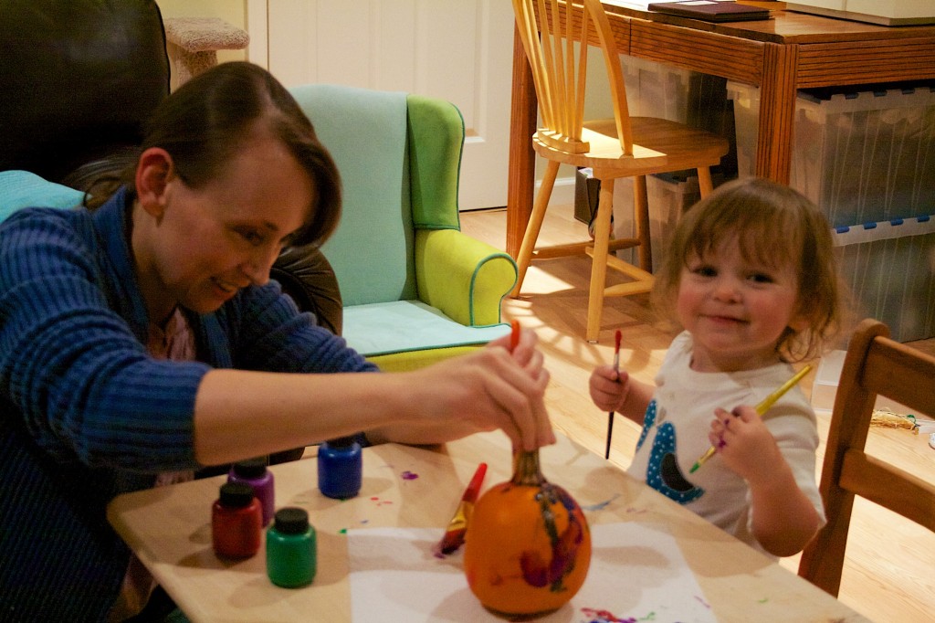
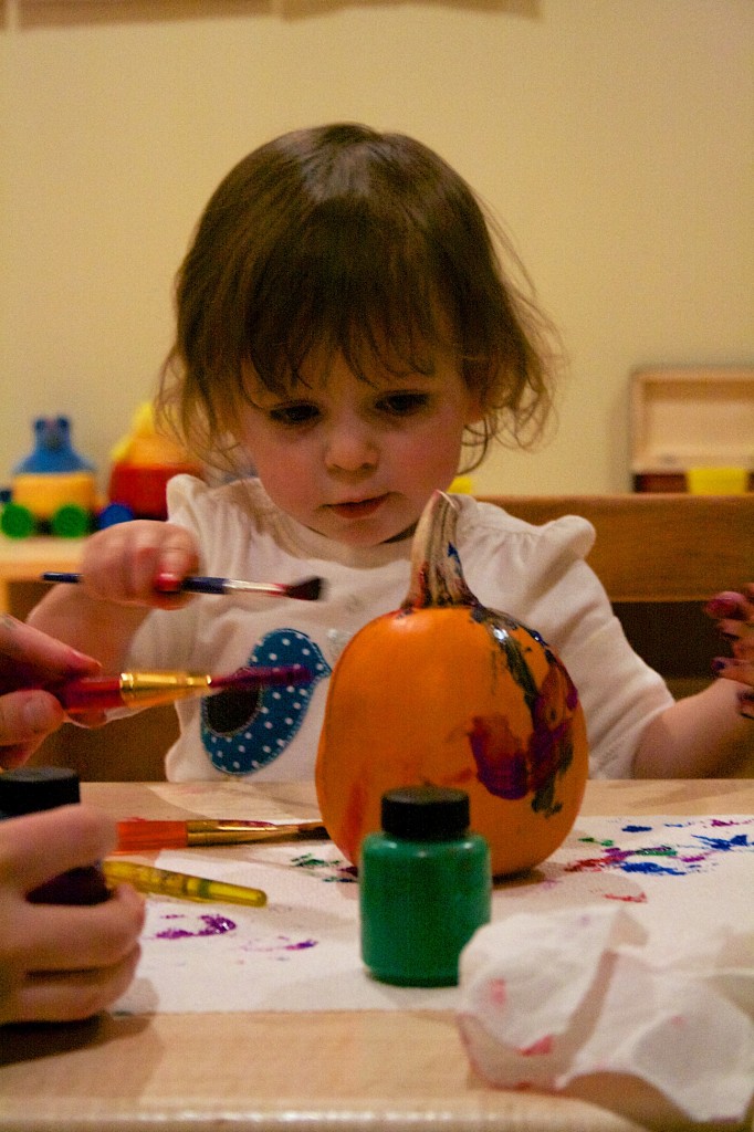
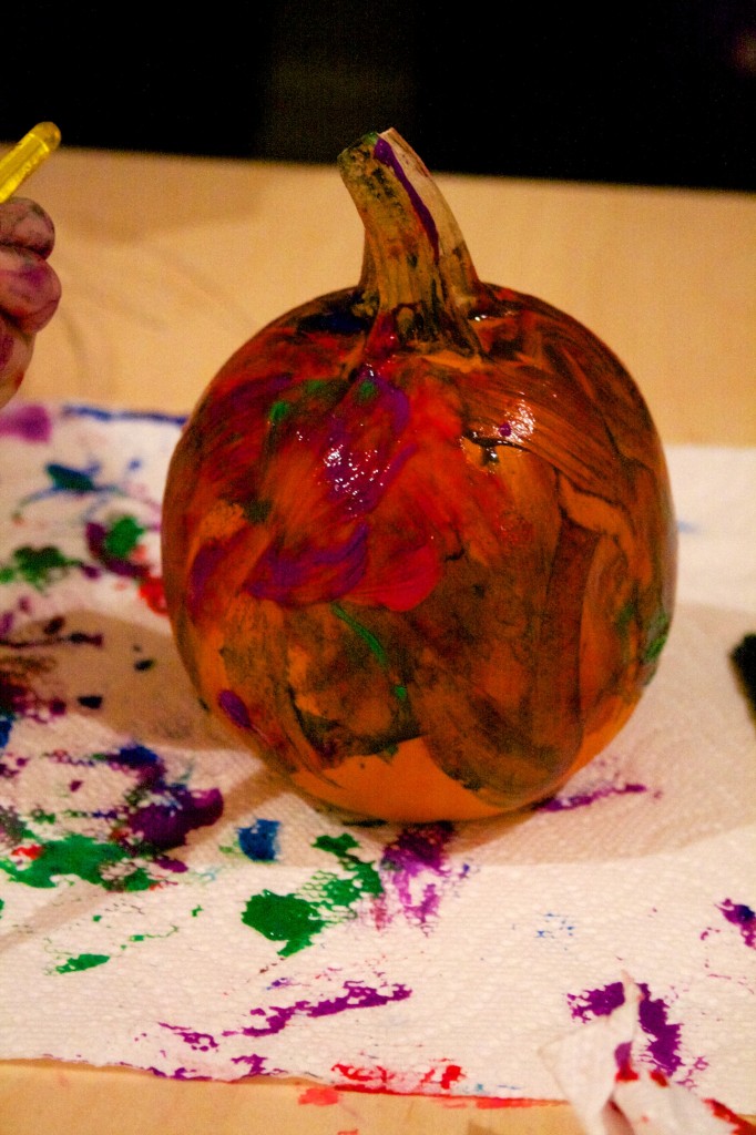
  • 2012: What a year! First, my daughter, Emma, is born. Daydreams appears in Strokes of Genius 4, and the Artist's Network posts it on their website for the book blurb. Colored Pencil Magazine asks me to do an article on the making of Daydreams. While perusing Dick Blick's website I discover Canson launched a new textured paper, Mi-Teintes Touch. I write a blog post reviewing it and, much to my surprise, Canson emails me a few days later and tells me they read my blog post. They hire me to do a freelance project creating artwork for a flyer advertising colored pencil on Mi-Teintes Touch. The Artist's Magazine contacts me and asks if I'd like to be featured in an article about colored pencil artists. Personally I think this was a series of fortunate events building off each other, exposure creating further exposure. I should note my entry into the 2012 CPSA Annual show was not accepted, although it would be accepted the next year in 2013 (different jurors each year - that's how the show works).
  • 2013: In terms of drawing frequency, I slow down quite a bit after Emma's birth in 2012. The Artist's Magazine article is published in May 2013, and Hopes and Dreams is accepted in the CPSA show. Drawing Magazine contacts me and asks me to contribute to an article on colored pencil, using Cascade.
  • 2014: I create an Adobe Behance portfolio. I suspect this is how PencilKings found me. They hire me to create instructional videos for colored pencil. Colored Pencil Magazine contacts me for an article, and uses Adrift for the cover. North Light Books uses Adrift for the back cover of Art Journey: Portraits and Figures. Adrift is a finalist in the Artist's Magazine Annual competition, and the Artist's magazine asks me to be a spotlight artist in 2015.
  • 2015: I notice that some of the places I've worked with (Colored Pencil Magazine, PencilKings) are helping me with promotion by reposting some of my Facebook updates for new works. Ann Kullberg's magazine includes one of my works in their Showcase section.
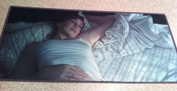
  • 2016: I post my drawing of my daughter, Emma, 3, on my Facebook page and it is reposted by Colored Pencil Magazine. Many of their followers repost it as well, and it goes viral. In the course of a few days my Facebook page doubles fans from 250 to 500+.

That's it! Seventeen years of scribbling. A few observations from all of this:

  • Where my base came from: Other artists. Early on it was people I met on ScribbleTalk, and then in person at the annual shows, plus connections through the CPSA district chapter. At my first national show, MaryBeth Lesko walked me around and introduced me to everyone (plus, I had a list of people I wanted to meet).
  • Things that I thought might have a big impact, but didn't: Magazine articles
  • Things that didn't work: In general, anything that involved trying to sell work to strangers over the Internet. Every print or original I've sold has been to someone I met in person, and the person has seen the original hanging on a wall.
  • Things that did work: Getting to know other artists and becoming part of a community. Getting involved in the local art scene via the art league, local art contests, and local gallery venues.

I don't have gallery representation, and I haven't pursued it, so I can't write about that experience. Elizabeth Patterson's story, though, has lots of detail about her gallery experience. If you bump into her, ask her about it.

Hope this helps, or at least is interesting. I'm trying to sort it out to see how it can help me get going with my writing.

Lastly, if you'd like to follow my fiction writing, give a Like at my Facebook page for it. I regularly post updates about my writing journey there.

By the Numbers

One of the many perks of being a member of the CPSA is receiving their magazine To the Point.  In it, you'll find photos of all the pieces in the Annual International or Explore This exhibition, and, tucked away in a table you'll find the statistics showing what types (landscape, portrait, still life, etc) of pieces were accepted into the show.  I've always been a little curious to compare that table to, say, a corresponding table from the Pastel Society of America or Oil Painters of America and see if the split is similar, or if there are subjects that colored pencil artists tend to gravitate.  One of the other things I've been curious about is the CPSA awards summary: are there certain subjects that tend to be more represented with awards? First stop is the CPSA website, which lists all awards with photos for each year.  I've focused on the Annual International show for this exercise.  CPSA doesn't assign a category to each piece, so I make up my own.  This turns out to be a little challenging: is Scott Krohn's self portrait assembled out of stones a portrait or a still life?  Hmmm. To get warmed up, let's start with something easier: how many awards were there each year, for the last 5 years? [ws_table id="1"] The number of awards has decreased. Keep in mind the awards have sponsors, and sponsors change over the years. If you look at the cause of the decrease:

  • Named awards decreased from 6 to 4.  The CIPPY, Prismacolor and Dixon Ticondara awards are the only 3 of the original 6 named awards remaining, but the CPSA District Chapters award introduced in 2010 makes the 4th.
  • Awards for Excellence decreased from 9 to 5
  • Awards for Outstanding Achievement decreased from 7 to 3
  • 3 intermediate awards between Excellence and Outstanding Achievement were created in 2010, the Award for Outstanding Recognition
  • Even though there are less awards, the cash value of the top prizes increased.  The CIPPY awarded $2500 in 2009, and $5000 in 2014.  The total value of awards in 2009 was $16,200 and in 2014 was $15,200.

Personally, I prefer fewer awards with the higher value for the CIPPY.  I like the Best of Show to win the big prize, and with typically 125 pieces in the show, 15 awards seems like the right number. So, next question is what subject matter tends to win the most? [ws_table id="2"] This table represents the same year range, 2009-2014, as the previous tables.  Not too surprisingly, "Still Life" is first, and "Portrait" is second, as these are traditional major categories of subjects.  If this were an oil or pastel contest, you might expect the third major category, "Landscape" to appear next, but it is relatively low on the list with only 3 awards; instead, "Animal/Wildlife" takes the third major spot.  "Urban Landscape" (city scenes, street views) is next, mostly composed of works by Elizabeth Patterson and Jeff George, followed by "Floral", then we're into subjects with 5 or less (1 per year).  A few observations:

Lastly, I've heard people comment that the same people always win, so let's see how the numbers look.  There were 6 shows between 2009 and 2014, so the best result an artist could get is an award at each show (6 awards).  Here's the actual counts: [ws_table id="3"] Most (74%) were single show award winners, and no one received an award at all 6 shows. Another way to think of it is to envision being one of the 15 award winners.  It's the Awards Banquet, they've just called the winners up to take their seats, and you sit down and look around curiously at the other 14 people, wondering what they'll win, and if they've won before. Odds are:

  • This is probably your first award, and the same is true for 10 of the other people around you
  • 3 people probably received one other award in the past 5 years
  • At this point, you + 10 people + 3 people = 14 of the 15 people seated.
  • The last person is probably familiar with his or her seat, because he or she has won 3 awards, and this will be his or her fourth
  • You and everyone else have an equal chance of winning Best of Show.  The number of first, second, third, and fourth time award winners receiving the CIPPY was about the same.

There you have it! Fascinating stuff.  Now that we've covered the numbers, I'll give a few non-number based thoughts: I don't think some subjects are more likely to get awards than others; I think that colored pencil artists tend to work in some subjects more than others.  Personally, I find landscapes particularly more difficult in colored pencil than figures, for example.  Similarly, the lack of Abstract awards is because there are few Abstract entries (note there were other shows outside of the 2009-2014 range which had Abstract awards).  I think concept is more important than subject, and usually the pieces which are top winners evoke some type of reaction and connection when you see them (particularly full scale, in person).  When I saw Jeff George's "Life and Death" CIPPY winner at the 2009 show, I wasn't walking away thinking about the technical aspects of the work, I was thinking about the work, and what it said.  I was mulling over mortality and this cross section of strangers, the awareness of all the similar crowds we walk through, oblivious of the lives that continue on and the others that don't. I thought about it after I had left the gallery.  I imagine this is what the juror reacted to as well, much more than the composition, color, and rendering of the people (which was also expertly done). Regarding the number of repeat winners, I was surprised by the actual numbers.  I thought most (more than half) would be repeat winners in the 6 show study, but actually nearly 3/4 of people were first time winners - pretty much the opposite of what I expected.  Strangely artists that I thought always won would actually win an award one year, then win an award 5 years later.  It's funny how your perceptions can skew reality. Well, hopefully this wasn't too much math, but instead some food for thought.  Enjoy!

Rebelution

It was 22 years ago, I had a department store job, and I'd just scraped up enough change to make my first big purchase.  You remember 1992, right?  Cuddled up on the couch watching

or if you were a bit nerdier like me:


$220 was a lot for me at the time, but it bought my first real camera: the Canon T50 SLR.  I actually still have it:

T50 Front
T50 Front

  It was mostly manual, although it did have a single Program mode on the dial that would provide auto aperture/shutter settings.  It came with an FD series 50 mm f1.8 manual focus lens.  I took a few good pictures with it.  One of the better ones was of my friend Carol, who wanted a portrait taken.  Here it is:

Carol
Carol

You can see that I always liked mood and light.  Being a film camera, you would take a few dozen photos and hope that you got the alchemy right to get the exposure and lighting effect you wanted.  There was no post processing (unless you had access to a dark room and wanted to dodge/burn areas literally by hand).  Photography was always like buying a bunch of instant Bingo tickets, peeling open the letters one at a time, and hoping one spelled BINGO. Eight years went by, and it was time for an upgrade.  Canon's EOS Rebel line had been launched, and the Rebel 2000 was newly released.  It looked quite different than my trusty T50:

Rebel 200 Front
Rebel 200 Front

The future is here with my 21st century camera!  Silver and gray contoured like a starship, and auto functions for everything.  Most notably, a built in pop-up flash, autofocus lens, and built in scene modes.  Simple 'auto' wasn't enough: you could set your flavor of auto: Portrait, Landscape, Macro, Sports, or Night Shot.  Plus, a digital display on the right showing you aperture/shutter/remaining shots:

Rebel 2000 Top
Rebel 2000 Top

The Rebel 2000 went on my first international trip, snapping pics across Europe  It piggybacked in my back pack up the side of the Gunks while rock climbing, and was there to capture the moment when I got stuck on a ledge with two other climbers.  

Xti Front
Xti Front
Xti Back
Xti Back

Another 7 years go by, and the world has shifted to digital.  I admit I am still enamored with film photography at this point, and reluctant to make the switch, but the instant availability of digital images is such an overwhelming benefit, especially now that I use photography as part of my color pencil process, that I move to the digital version of my film camera, the Rebel Xti: The Xti is serious with it's monotone black color scheme.  It retains all of the Rebel 2000 functions, but adds an LCD screen on the back for settings and viewing images: Unlike point and shoot digital cameras, you cannot take pictures with the LCD screen; you must look through the view finder the same as an old school SLR.  This is because for the LCD to see anything, the mirror must flip up to expose the sensor (it is an SLR, after all).  Another quirk of the sensor is that it is smaller than a 35 mm piece of film, so in effect you get an amplification telephoto effect from your EF lenses.  The digital Rebel has a new line of lenses which compensates for the amplification: the EF-S line (fortunately the base EF lenses still fit).  Most of my colored pencil artwork started with poses photographed by the Rebel Xti, and nearly all of my pictures of Emma.  The biggest ability I've gained is the ability to instantaneously check and adjust exposure for difficultly lit subjects. 

So, that brings us to 2014.  It's been 7 years since my last upgrade, and I seem to be on a 7 year cycle, so I make the leap the latest Rebel, the Canon Rebel T5i.  Considering my first camera was the T50, the T5i almost brings me full circle in camera titles.  The T5i has numerous upgrades: more megapixels, more autofocus points, more scene/program modes, but the standout features are:

  1. HD Video with an articulated LCD that swings out, so you can use it like a hand held video camera
  2. iPhone-like touch screen with pinch/zoom/swipe gesture control
  3. Ability to shoot pictures using the LCD (although this bypasses the viewfinder autofocus system and uses the poorer video AF)
  4. Digital step motor lens with image stabilization (autofocusing is fast and silent for video recording, and the lens senses its own motion and compensates for it to reduce image blur)
Emma's Snack Time
Emma's Snack Time
Camera Group
Camera Group

A sample of the T5i's pictures:   I'm really amazed by the colors the new camera is able to capture.  HD video, which I'd previously been capturing with my iPhone, now has a cinematic quality to it, able to use all of the features (scene modes, depth of field, etc) that are available for stills. I think most colored pencil artists work from photographs, and, by necessity, most learn photography skills.  Starting with a photo reference which is poorly or overexposed makes the job of the artist much harder, and starting with an excellent photo helps greatly.  Looking at some of the photos from the earlier generation Canons, you can achieve some good results - it's just harder.  Colored pencil drawing is hard enough, so making things a little easier on the photography end is welcome! Here's the evolution of the Canon cameras together:

Snug as a Bug

Adrift is all packed up and getting ready to ship to Florida for the CPSA 22nd Annual International Exhibition.  This year I did my piece on a full sheet of Canson Mi-Teintes Touch paper, which is a few inches larger than my usual Artspectrum Colourfix paper.  When I framed the work, I butted up against the CPSA's size limitation (32" x 40") for the show, coming in at an inch or so under max. IMG_3326   IMG_3330 
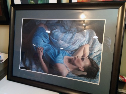
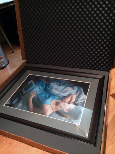
Years ago I bought an Airfloat Systems Strongbox for shipping my work, and looking at how ragged it's become, you can tell I got my money's work.  I was a bit nervous that my max size piece wouldn't fit in my Airfloat strongbox, but it just made it with 1" to spare: IMG_3332 
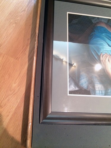
Now I just need to print up my FedEx labels and drop it off at the pickup point down the street, then it's off to the show!

There Is Nothin' Like a Frame

Ah, cheesy puns.  My specialty.  For those of you who have not had to sit through South Pacific, here's the bit:

In my case, it was 1988, and I was sitting through it from the perspective of the stage.  Each year my high school had a musical, and, as someone with the vocal talents of a cat with laryngitis, I was relegated to parts like "man in bar" or "sailor #3".  In South Pacific I played a sailor nicknamed "Professor" who had a few speaking lines, but generally lounged on the stage for two hours with the rest of the sailors.  I did get to sing "There Is Nothin' Like a Dame", though. Here's a Throwback Thursday worthy snapshot of the ensemble:

South Pacific Ensemble

I'm standing to the right of Stewpot:

South-Pacific-Shawn1-384x500.jpg

Hit the fast forward button 26 years to 2014, and you've got the context for me humming that song as I began cutting the mat for "Adrift" ("There is nothin like a frame, nothin in the world....").  Framing's a much anticipated part of the process where everything hopefully comes together.  Usually I order a frame from FramesbyMail with foam board and plexi, cut the mat myself, then  do the art mounting, point settings, dust jacket, and hardware.  I often struggle when selecting the mat color because my pieces tend to be on darker papers, and white mats are too harsh in contrast.  Nonetheless, my first cut at the piece was a black frame, white outer mat, and dark gray inner mat:

IMG_30021-500x375.jpg

Not surprisingly, the white was a bit too stark.  The next color tried was "Before Dark":

IMG_30161-500x375.jpg

Better - but the gray was more of a French Gray 70%, which looked brownish.  I also wasn't happy with how thin the mat spacing was for the picture size, so finally I broke down and got professional help:  I took my work to Marquis Art and Frame to have it professionally framed.    This week I got the final framed piece back, and it looks great:

IMG_6757-500x333.jpg

Marquis chose a larger medium dark gray mat with a light gray inner mat.  The frame itself is an expresso color with a nice profile:

IMG_6760-500x333.jpg

When we chose the frame and colors, we needed to carefully ensure the dimensions were within the maximum allowed for CPSA shows.  The final frame is about 1" away from maximum in both directions (it's a little exciting to have a piece big enough to hit the size limit). If you compare the final product with the first white mat version, you can see the difference having the right mat and frame makes.  Now I just need to box it up and get it ready to be shipped for the CPSA show!

Adrift - Lizza's Scan

Today was MLK day, and I had the day off from work.  My wife and I had a lunch date at Canteen 900, where I had a giant mug of hot chocolate and a multigrain turkey and brie sandwich.  Canteen 900 is located in a very artsy, eclectic building, which is very cool to walk around and just explore.  One of the things you'll find in your explorations is Lizza Studios, and it's owner, Bob Lizza.  Bob has been doing my scans and prints for years.  His studio has an incredible, one of a kind scanner which does ultra high resolution reproductions.  People literally come from around the world for Lizza's services - Bob has even done work for the Vatican.  So, I'm incredibly fortunate to have his studio located 15 minutes from my house. I was expecting to drop off the art, then come back for a few proofs in a week or so.  To my surprise, Bob asked if I was free today and said "I can get it done this afternoon."  Awesome! I took off for a bit, hit a Barnes and Noble nearby and bought a few cute books for Emma, then returned an hour later.  The proof was printed and waiting.  I had to stare at it for a few minutes before finding the slightest tweak, then Bob opened up Photoshop and made it quickly, and another proof churned off the printer.  It was a perfect match.

Bob Lizza, making the final adjusts for the proof


Here's a little piece of detail of a small piece of blanket fold from the full size scan:

Detail

Bob burned a DVD of the full sized image (400 MB @ 450 dpi), and I'll resize that image to the CPSA's specifications and use it as my entry for this year's show.  The deadline for entry is always at the end of March, and it's nice this year to have everything wrapped up early.  Now, time to start a new piece!


Happy Halloween 2013

This weekend we carved our pumpkins.  When we went to the pumpkin farm to pick them out, Emma also picked out a small one for herself, and today she painted it (her first painting project in the play room!): IMG_6283

IMG_6294

IMG_6316


Happy Halloween!

Chalk it Up

With a bit of active imagination, it's quite easy to imagine that everything you've ever misplaced has not been lost, but instead has fallen through a crack in reality only to land in a great collection of junk in some subterranean room.  It turns out the entrance to that room was through a door in my kitchen, down a flight of bare wood stairs, and into a dank cinder cap walled basement.  At least it was until 2009, when we decided "medieval dungeon storage room" was not the right design direction for the basement.  If this were a tv show, there'd be an awesome time lapse montage showing stacks of 2 x 4's turning into framed walls while contractors flash in and out of frame, ladders appearing with electricians installing lights, panels of drywall coloring themselves in rolled on swathes of paint, and the final reveal of the basement turned studio.  Since it's just a blog point, though, I'll show the start:  

Stairway Wall Before

and the end:


Studio

Four years of me at my table drawing and Kiersten at her loom weaving have given us our money's worth for the space, but now in 2013 the room has hit another evolutionary branch.  Each day as we navigate the Wipeout style baby toy obstacle course that our living room has become, we think how great it would be to have a little more space, or, at the very least, a playroom.  After a flurry of consolidating and baby proofing, we've started updating the studio to have a play area.

Emma's hit the stage where she loves crayons, and we're always trying to intercept her as she takes one and heads towards a wall.  This is why it was a particularly great idea of Kiersten's to paint a chalk board panel on one of the walls.  A trip to Lowe's readily found the can of chalkboard paint, a roll of Frog tape and some rollers, and we were good to go.  This past Saturday I masked out the space and put pigment to wall.

Chalkboard paint looks like a slightly thicker than normal bluish black paint.  You roll it on with a roller, discover it doesn't really stick the same way as paint, then get artistic with your application patterns trying to move around heavier blobs to cover swiss cheese splotches, and finally let the first coat dry enough that you can hit it with a second coat.  All of this was happening during the magical time to get things done known as Emma's Afternoon Nap.  1.5 hours into it I had finished the second coat and was starting the clean up, with hands filled with paint covered pieces of Bounty, paint can lids, mixing sticks, and a roller and paint tray.  Glancing at the baby monitor to see Emma still snoozing,  I thought, hmmm....this went smoother than expected - glad the cat was also napping the whole time.

Almost on cue I felt something furry brush past my ankle. I looked down at Iggly.  He looked up at me, then looked over at the black wall and you could just see him thinking, hey, what's this now?  and swooshed his tail into the paint.  Suddenly alarmed that it was both wet and sticky, Iggly turned into an orange streak in an apparent attempt to outrun the paint that was stuck on his tail.  This resulted in his tail acting like a paint brush, leaving black curved lines of paint on the floor randomly as I chased him with my armful of paint supplies.

There's a internet meme named "Pink Shirt Guy" which I love.  Words won't do it justice, so here it is:

pink-shirt-guy

I'd love to know the story behind this photo.  I've seen it posted in inspirational poster format with the caption, "Curiosity: Whatcha doin?". I'm pretty sure if Iggly were human, he'd be Pink Shirt guy.

Kiersten arrives home with the groceries to find me circling our now black tailed cat around the dining room table in a strangely choreographed dance, and after some joint tackling we thoroughly soap his tail clean.  A few hours later I head back downstairs to peel off the Frog tape and check out the final result:

Chalk board panel

Cool.  Now we just need to wait  a few days for it to completely dry, rub it with some chalk the first time to prime it, and start doodling.  We've got a toddler height section for Emma, and a higher section for her parents.  The remainder of the studio is still available for us to do our hobbies while Emma is playing in her area:

Play area (in progress)

Art studio area

Sewing area

Website 2.0

I've consolidated my blog and portfolio to a single site, www.shawnfalchetti.com, and updated the design to have a cleaner layout with some nice typography and plenty of breathing space for the blog content.  One of the interesting technical aspects is that I'm using Wordpress as a true content management system, serving up all of the static web pages as well as the blog content.  This means updating the static content (exhibitions page, etc) has become much easier because I can use Wordpress' content editor, instead of opening up Dreamweaver and editing HTML.  Hope you like the update!

MusingsS.D. FalchettiComment
Delayed Reaction

Every now and then a bit of chemistry occurs between my fixative and my artwork.  I wrote a post a while ago about one of my red pencils bleeding after being sprayed with fixative, and also posted some before and after photos of how fixative darkens a piece.  In each case, though, this occurred before the fixative was fully dried.  So, it was particularly surprising when I wandered into my studio (well,  my basement....but studio sounds more professional) and found the latest victim:  Daydreams.  Blue pigment had bled along the pattern in the sheet and folds in the shirt: IMG_2390

IMG_2391

What's puzzling about this particular who-done-it is that Daydreams was drawn in 2011.  It went to Lizza Studios for a few weeks where it was scanned.  It went to the Wilkes-Barre Fine Arts Fiesta where it was outside under a tent for a week.  It even went to Houston, Texas, during the heat wave when it was 112 degrees outside, and was shipped back to Pennsylvania.  Afterwards it lived on one of the walls for my house for the next two years without incident.  The only thing that changed is I moved it to the basement.  I'm wondering if the humidity of the basement played a factor.

After removing the picture from the frame, I was able to repair the discoloration by layering lighter colors over it, then redrawing the affected part of the pattern.  Aside from redrawing the original colors, I layered peach over the bluest areas to desaturate it, since the best way to tame an out of hand color is with its compliment.

IMG_2393

It was nice to see Daydreams out of its frame.  Like many of my pieces on dark paper, it really looks best in bright light:

IMG_2396

My Heart d'Aches for You

Every now and then at work a little windfall comes my way in the form of an Amazon gift card.  The beauty of gift cards is that you're expected to get something you want, but not necessarily need, so your purchases are guilt free.  It's part of the same line of reasoning that reduces the calories of all foods consumed on my birthday to zero. Today, exactly 2 days since I clicked the "Checkout Now" button, the brown Amazon smiley face box arrived on my doorstep.  I eagerly took it inside to the counter and cut open the sealing tape.  A brushed metallic tin gleamed out from the bottom of the box.

Confession: before I show the tin, I should say that the gift card (which was generous!) didn't quite cover the purchase price of what I wanted.  So, I splurged a bit.  Okay, quite a bit.....but did I mention that I really wanted it?

Back to the box.  I lifted out the tin, and....

IMG_2370

...a full set of Caran d'ache Luminance pencils!  Cue the Barry White music as I opened the tin:

IMG_2372 
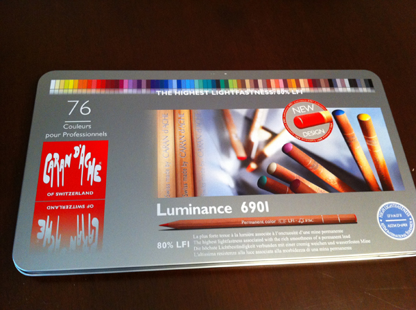
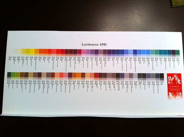
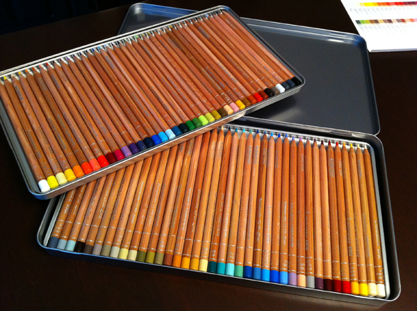
The Luminance pencils really are exquisite.  I've been purchasing the flesh tone colors open stock and using them in my pieces for a while now.  The pencils have a nice natural wood casing with silver text printed on them, and this set had a little sticker on it calling out the improvement of the colored ends so you can tell what color a pencil is at a glance.  Another nice touch:  although both pencil trays are plastic, the upper one sits in a removable metal tin so you can lift it out without the pencils spilling everywhere. What's interesting about the 76 color set is that it's really ideal for drawing people.  It comes with a nice paper insert with all of the colors shown:

IMG_2373

I'm really looking forward to drawing with my Luminance pencils.  At $4 a pencil I'm a little scared to sharpen them, but I'm sure I'll get over it.

Big and Small

I received a gift card from Kiersten's parents for my birthday which I merrily used to purchase a cornucopia of art supplies.  Today the instant message chirp sounded from my phone letting me know that Amazon had delivered my package.  Somehow the Fedex guy is part ninja and always stealthily advances to my front porch to deposit a box while I'm home without me noticing, and 4 seconds later the only trace of his passage is the text message Amazon sends my iPhone confirming delivery.  I passed through the series of gates that form the baby airlock to the front porch, gleefully scooped up the plain brown box, rushed to the kitchen island to tear it open, and begin unloading my loot.  Snuggled in amidst packages of replacement Xacto blades was the centerpiece of the order, my new electric pencil sharpener. I have to admit that finding a worthwhile pencil sharpener is a real quest for a colored pencil artist.  Colored pencils require a constant super sharp point to function properly, and the wax binder tends to gunk up all the blades and gears of most very quickly.  I had an Xacto model that I loved which lasted years, and when it retired I was pleased to find the exact same model in my local hardware store.  Now that the replacement needs replacing, I've eyed up something a little more heavy duty.

As I unpacked the new Swingline model and set it beside my old Xacto model, I couldn't help but think it was the pencil sharpener version of the Crocodile Dundee "That's not a knife" scene.  I'll show you what I mean:

sharpener

That is one big pencil sharpener.  You carry it with two hands like you would a vase. It has its own pencil holding pouch in the back, you know, in case it gets hungry because you're taking too long between sharpenings.  The red disc rotates pencil size openings so I can finally fit my Caran d'ache Luminance pencils in without feeling like I'm driving a tent stake into the ground.  Time will tell how it fares against the wax binder buildup test.

Setting aside the sharpener for a moment, I moved to the other end of the size spectrum.  I wrote a post a while ago about my conversion to a Macbook Air as my main computer, and some of the challenges of its lean 128 GB solid state drive.  It's amazing how quickly photos and videos start filling that up.  Equally amazing is how small and cheap flash drives have become.  In my box of art goodies was a 32 GB low profile flash drive which snapped into the USB port of my Air, instantly increasing my storage space by 25%.  My reaction to seeing it was similar to my pencil sharpener, just opposite in scale, because the entire thing balanced on my fingertip.  When plugged in, only the black part sticks out, and you barely notice it's there.  Pretty neat!

flash computer

flash 2

iArt

I just celebrated my 42nd birthday last week, and was thinking back to the pre-internet days of my youth.  I remember in college when we were given the option for the first time of writing a paper or creating a webpage.  Soon after I marveled as the robotic arm in our engineering lab came alive one night, reached over and grabbed a paintbrush, dipped it into some blue paint, and began painting waves on a nearby canvas.  A little webcam taped to it was allowing people to control it over the Internet as part of the PUMA Paint project.  People I'd never met from countries I'd never been to were painting pictures in a room that contained only me and a robot. Now, hop into your DeLorean, charge the flux capacitor, and jump to present day.  No flying cars, but the Internet is ubiquitous, and it's all about connecting you with people.  As an artist, you probably have a blog, a portfolio web page, a personal Facebook page, possibly an artist's Facebook page, an Etsy shop, a Pinterest profile, and maybe a Twitter account.  Keeping up with everything can be a challenge.

Ratchet that challenge up to level 2 by thinking about what people are using to read your online media: laptop, iPad, iPhone, Android tablet, Kindle Fire?  What looks great on your desktop monitor might be unreadable on a cell phone screen, and your Flash based online gallery won't work at all on an iPad.  Since more and more people are surfing the net from tablets and smartphones, it's easy to unintentionally block out some of your audience.  I spent the past week fixing this for my sites.  Here's the main changes:

Provided an alternative to Flash and touch navigation for tablets:

When Apple launched the iPhone and iPad, they decided to not support Flash.  My portfolio web page uses a Flash based program called SlideshowPro to display my artwork.  This week I upgraded it to a version which has different galleries depending on what device a visitor is using:  a fancy Flash gallery for computer users; a HTML5 touch screen gallery for those with iPads or tablets.

Changed the porfolio web page to resize itself based on the visitor's screen size:

For those savvy to CSS, I changed my page layout and image sizes from fixed to fluid.  Everything scales to consistently fit on a viewer's screen regardless of how big or small the screen is.  This is particularly handy for iPads and iPhones, which have portrait and landscape modes:

Two small changes, but now everything is iPad/Kindle/smartphone friendly.  A little food for thought if you manage your own web pages.

IMG_2078


IMG_2077

Emma 1.0

Just a little more than a year ago, I had a very remarkable President's Day.  It started at 4 am with my wife, who was 9 months pregnant at the time, nudging me awake.  It ended in a hospital room with Kiersten in her bed, me in a recliner, and a small, beautiful six pound baby girl swaddled snoozing in a cart between us.  We named her Emma. IMG_1340

I wrote this in my original post about our first week home:

The past 7 days have been a single, long, wonderful day.  Day and night have blurred together; quiet times and crying times, sleepy times and cuddling times, lots of diapers and burpings, and mom and dad promising to take a nap themselves, always tomorrow.

In many ways, the past year feels like that first week.  The days have blurred together and sped right along, and it's hard to believe that same small, swaddled baby is now standing up and pushing buttons on her activity table, turning pages on books as we read them to her, stealing the tv remote, and looking very much like a little girl.

IMG_1483   IMG_1720   IMG_5014


This upcoming weekend is Emma's 1st birthday party, complete with a theme (jungle animals!) and a small smash cake for her to demolish.  I'm really looking forward to it!  It's also put me in a retrospective mood thinking about the past year, and the changes that came with it.

One of the many perks of having a baby is that you get to redefine what is meant by normal adult behavior. Case in point:

Earlier today I was lying on the kitchen floor, on my back, with my feet up on the garbage can lid. Pre-baby, this probably would have been cause for concern for my wife,  but with Emma merrily pushing her blocks around my head and occasionally stopping to grab my nose, it seemed the place to be.

This really extends to the whole range of activities you probably haven't done since you were a child: lying on your stomach playing with blocks while Saturday morning cartoons are on; reading rhyming Dr. Seuss books; actually making the animal sounds ("moo!") or the train sounds ("choo choo!") when you read them aloud; making raspberry sounds with your lips and funny faces just because it's silly - all perfectly fine when you're doing them with your toddler.  Having a kid renews your license to be a kid.

It's also fun that this is contagious.  Emma has an assortment of blocks, disks, and rings to stack.  Right now she likes to take them apart much more than put them together.  Any adult who visits and finds himself in front of them for a length of time will unknowingly begin to assemble them.  Colorful blocks with holes, the pegged wooden framework of a train waiting to be complete - it's irresistible.

But, aside from rejuvenating your inner child, having a child also makes you want to stretch your grown up side, too.  You'll want to be better than your pre-baby self - a better teacher and example, more patient, more flexible, and just an all around more grown up version of yourself.  But, interestingly enough, you'll do this all while being more of a kid than you've been in years.

I considered writing about all of the wonderful ways things that have changed, but I realized I didn't have the words - I'm not sure how to sum up the joy of spending a weekend playing on the floor with Emma and Kiersten, making airplane sounds while spooning baby food as the three of us eat dinner together as a family, hearing Emma's laugh, seeing her excitement when she discovers something new, or just watching her turn pages as I read a book to her at the end of the day - so I've written just a few musings for today.  Now, I've got some birthday party tables and chairs to set up!

Jumping Ship

After 7 years of writing my art blog using Wordpress hosted by GoDaddy, I've jumped ship and switched over to Google Blogger.  The main difference you'll see is just the address:

Old Address www.shawnfalchetti.com/wordpress

New Address shawnfalchetti.blogspot.com

All of the content was migrated over, and I was even able to find the same notebook theme so that visually the site looks about the same.  The only thing that seems to have not made the transition were comments.

Why the move?  To be honest, I'm unsure if it's the latest Wordpress update, GoDaddy's issue, or something that's broken on one of the Wordpress plugins I have installed, but my site has ground to a snail's pace.  Load times for posts were > 30 seconds.  With enough technical effort I probably could figure out what was broken - but that's just it - I always seem to be troubleshooting.  Wordpress is a terrific blogging platform with infinite customizability, but that complexity makes it easy to break things.  I have a whole series of Woes of the Web posts where the latest Wordpress upgrade has resulted in my blog going offline for a week.

So, here's a few of the pros and cons I've seen between the two platforms:

Wordpress:

PROS:

  1. Free, but may require a web host:  You have two options: 1) download the program for free from Wordpress.org and install it on your website.  In this case, you are likely paying a company like GoDaddy a monthly fee for the website; or 2) create a free blog on Wordpress.com.
  2. Highly Customizable: Thousands of themes and plugins are available on the Internet for free.  Themes define the appearance of your blog.  Plugins add features to your blog, such as a guest book or connectivity to social sites like Facebook.
  3. Elegant Interface:  Writing in Wordpress is liking writing in Microsoft Word.
  4. Free upgrades: People are constantly adding more features to Wordpress.  Every few months a free upgrade rolls through.

CONS:

  1. Complex:  Sometimes all of the customizations don't play well together, locking up your blog or otherwise creating errors.  It can be very difficult to troubleshoot, and you may need to even dive into computer code.
  2. Difficult for you to create a custom appearance, unless you are fluent in CSS and PHP:  If you can find a theme someone else has made which looks like what you want, great; if you can't, making one yourself requires computer knowledge (PHP programming) that the average person doesn't have.
  3. No community if self installed.  There's no "Followers" feature like Google has, although there are some plugins that integrate Facebook likes.

Google Blogger:

PROS:

  1. Free, period:  It takes 10 minutes to go to the Google Blogger website and make a blog.  There is no cost, and you do not need a website provider.
  2. Simple:  Basic interface, and limited choices for themes and gadgets.  The focus is on blogging, rather than bells and whistles.
  3. Easy to customize:  The dozen or so themes built in to blogger are very easy to customize.  There are sliders for easily adjusting column widths, color pick boxes for changing font colors, and drag and drop layout editors for changing where elements appear on the screens.  With a little tinkering you can take a basic template and make it look quite flashy in just a few minutes.
  4. Community:  Everything is integrated into your Google Profile.  If you have blogs you already follow, they show up in your link list automatically.  Other people with Google profiles can follow you, Facebook style.  A web ring is automatically created that allows people to move between blogs of friends.

CONS:

  1. Limited customization:  The list of available Google Gadgets is small compared to the giant list of Wordpress plugins.  Many of the fancy add ons you may be used to with Wordpress just don't exist for Google.
  1. Somewhat limited themes:  There are external sites which have free themes to download, similar to Wordpress, but the vast sea of Wordpress themes does not exist for Google.  In general, your best bet seems to be using the built in themes and their customization features.

Well, this is my first post on Google Blogger.  More to come!

MusingsS.D. FalchettiComment
Merry Christmas 2012

A jazzy version of "White Christmas" is playing on the stereo as I type this, sitting by the glow of our Christmas tree.  It's just a small Charlie Brown tree, but it's filled with ornaments given to us by our family, and lots of love.  Usually we shuffle around the furniture in the dining room to set it atop one of the cabinets, but this year the dining room has been overrun with bouncer seats and play gyms, so it caused us to do something we've wanted for a while now - set it up in the living room.  I snapped a picture of Kiersten, Emma, and Iggly all hanging out together by the light of the tree.

This year there are two new ornaments - one from each of our families celebrating Emma's first Christmas.


Merry Christmas!

Somewhere, Out There

...beneath a pale blue sky.  Okay, I'll stop my Fievel song (Linda Rondstadt and James Ingram, anyone?), and get back to typing.  Colored Pencil Magazine posted a tip about how to use Google Images to locate your artwork on the web (go to Google, click on images, click on the camera icon, and upload one of your images.  It will show you all the websites with that image).  I've done text searches before which have ranged from interesting (my artwork was used for the Strokes of Genius 4 blurb on the Artist's Network site) to downright hysterical (like when my wife and I googled our last names and found her's was famous for The Wilhelm Scream, and mine always found this somewhat PG-13 music video).  So, of course, I was really curious what an image search would find. The image search was for "Opaline Dreams", and the first hit was this article on the Russian blog, Look at Me.  Google happily translated it into English, and it is actually quite a nice article on four artists.  One of the funny things is how Google Translate tackled the quote from my artist's statement, which went from English to Russian back to English again.  My original statement was:

The relationship between light and mood has always fascinated me. There’s an inherent drama to a high contrast figure bathed in sunlight, while a quiet, diffused interior has a lazy, colorful atmosphere which suggests what’s behind the scenes has a whole life of its own. I find what's behind the scenes and tucked into the shadows is far more interesting than what routinely gets the spotlight.

and Google's translation became:

I have always been interested in the relationship between light and mood. In sunny silnokontrastnoy figure is a drama, and a lazy atmosphere shaky night for the peace and quiet - a lifetime. Drags me that behind the scenes, what is hiding in the shadows

I'm kind of digging it in a poetic kind of way.

Next up was "Haven".  What was cool about "Haven" was not where the art was (which was only on my site); it was the image that got matched with it.  Here's Haven:

and here's the picture that Google matched with it, which comes from the blog of Karinne Ribeiro.  Neat!

Next up was "Hopes and Dreams", which, not surprisingly, found a whole bunch of pregnant women on the internet.  Last up was "Cascade".  Here's the actual Google result of images scattered across the internet which are visually similar to "Cascade":

It's all my stuff!  My stuff, it turns out, looks like my stuff.  My favorite photo in that bunch are the two jack-o-lanterns....which are also mine (well, the one on the left is, at least.  Kiersten gets credit for the one on the right.)  Apparently I use the same visual approach to pumpkin carving that I do to colored pencil drawing.  Which is the perfect segue way into the post I'll write this weekend (hmmm...can you guess what it will be?  I'll give you a hint: it will be visually similar to the group above).