Shawn Falchetti, CPSA

Blog

The Artwork of Shawn Falchetti
Posts in Colored Pencil
Adrift - Lizza's Scan

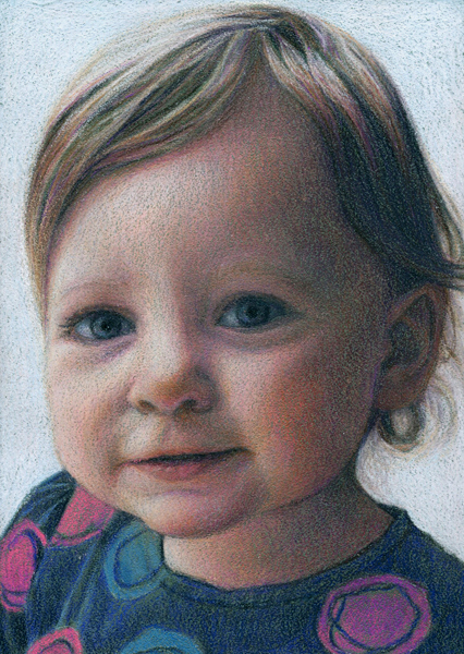
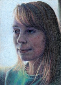
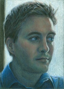
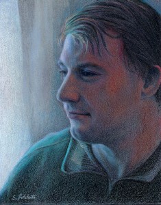
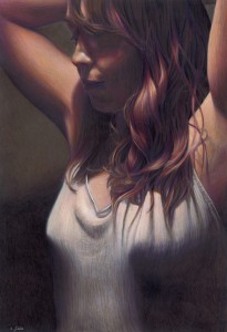
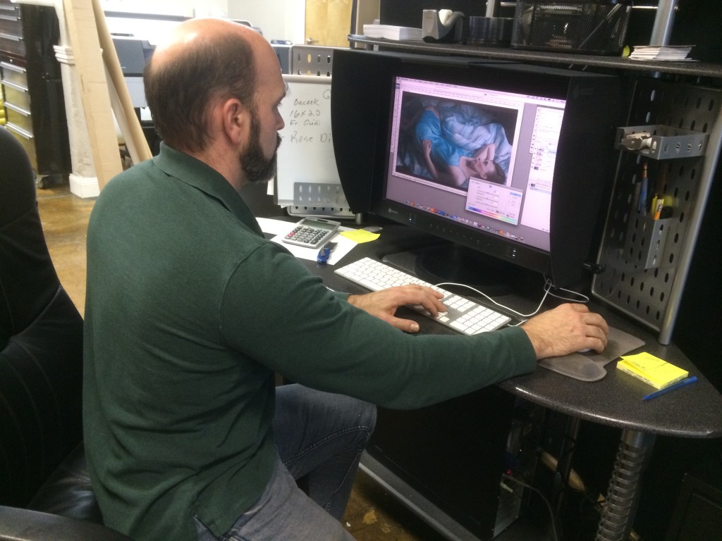
Today was MLK day, and I had the day off from work.  My wife and I had a lunch date at Canteen 900, where I had a giant mug of hot chocolate and a multigrain turkey and brie sandwich.  Canteen 900 is located in a very artsy, eclectic building, which is very cool to walk around and just explore.  One of the things you'll find in your explorations is Lizza Studios, and it's owner, Bob Lizza.  Bob has been doing my scans and prints for years.  His studio has an incredible, one of a kind scanner which does ultra high resolution reproductions.  People literally come from around the world for Lizza's services - Bob has even done work for the Vatican.  So, I'm incredibly fortunate to have his studio located 15 minutes from my house. I was expecting to drop off the art, then come back for a few proofs in a week or so.  To my surprise, Bob asked if I was free today and said "I can get it done this afternoon."  Awesome! I took off for a bit, hit a Barnes and Noble nearby and bought a few cute books for Emma, then returned an hour later.  The proof was printed and waiting.  I had to stare at it for a few minutes before finding the slightest tweak, then Bob opened up Photoshop and made it quickly, and another proof churned off the printer.  It was a perfect match.

Bob Lizza, making the final adjusts for the proof


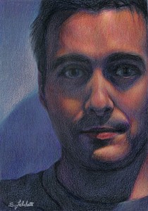
Here's a little piece of detail of a small piece of blanket fold from the full size scan:

Detail

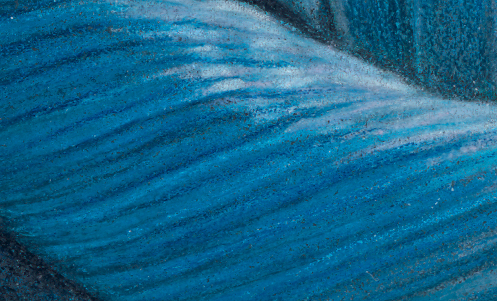
Bob burned a DVD of the full sized image (400 MB @ 450 dpi), and I'll resize that image to the CPSA's specifications and use it as my entry for this year's show.  The deadline for entry is always at the end of March, and it's nice this year to have everything wrapped up early.  Now, time to start a new piece!


Family Tree

Some projects have a way of creating themselves.  Quite a few years ago my local CPSA branch had a member show which included a self portrait project.  It was a fun idea where all of the artists bios were next to their respective portraits.  I created a little 5" x 7" drawing on Pastelbord, and I still use it as my avatar on my bio page and blog. A few years later, in 2008, I got married and thought it would be a cool idea to draw an identical portrait of my wife, Kiersten.  We recreated the same pose and lighting, but looking the opposite way, so when the portraits were set together they would form a cameo.  The two framed drawings were on the table at our wedding reception with our guest book.

Zip on over to 2013, and we've got a beautiful toddler bouncing around.  So, of course, the natural next step was to do another 5" x 7" in the same format of Emma and add it to the cameo.  After thinking about the moody, blue palette of the first two, I decided to take a bit of artistic license and brighten up the palette as well as more directly light Emma.  Here she is, along with the three pics together:

Emma Small

IMG_2495

CPSA Silent Auction

Each year the CPSA holds a silent auction during convention week at the Annual International Exhibition.  If you get a chance to go, be sure to attend Thursday night of convention week.  It's a fun night where you get to see all of the entries, get some great door prizes, and bid on the auction.  The auction quickly escalates into a frenzy of last minute bids as everyone tries to get his favorite piece. I was one of the invited artists this year to contribute a piece to the silent auction.  Auction pieces have a  size limitation of 11" x 14" matted so that everyone can take their piece home in a suitcase; also, because the auction is called "Small Works of Great Magnitude".

My piece for this year's auction is titled "Kiersten", and was completed with Prismacolor Premier, Caran d'ache Luminance, and Lyra colored pencils on Light Blue Canson Mi-Teintes Touch paper.  I really love the color of the Mi-Teintes Touch paper, and matted the piece with 3/4" of bare paper.  If you like it, you can bid on it on the CPSA show Thursday night, 8/1.

Kiersten CPSA Auction

Sunrise

I completed my first piece on Light Blue Canson Mi-Teintes Touch, titled "Sunrise", using Prismacolor and Luminance colored pencils.  I really liked the color of the paper and decided to include a 1" border of bare paper around the piece, signing it in the border like I would a print.  I enjoyed working on the Mi-Teintes Touch.  The texture of the paper was prominent in the first few layers, and in a few places I let it show through heavily.  In other areas, such as the sunlit hair and window, I was able to saturate the paper with colored pencil and achieve a good range of values.  The grit was very even and allowed for nice, uniform layering and transitions of colors in the background.  I think the light blue color is a nice choice for portraits and figures - it has just the right mix of blue with a touch of green.  One other thing I liked about the paper: the weight.  At 353 gsm, it's a little more than 50 gsm heavier than Colourfix paper, and has a nice feel to it.  There's something about heavy art papers that I love.

Here's a detail of the shoulder area, where I let plenty of the paper's texture show through:

A detail of the background transitions and texture:

And a detail of the hair:

Hopes and Dreams

I started my latest drawing before the arrival of my daughter, Emma, and managed to squeeze in some time in the few delirious fleeting moments of free time afterwards to complete it.  Since I planned on entering it as this year's CPSA entry, one of the extra challenges I had was prohibiting myself from using Neocolor II washes to block in the initial colors and shadows.  Actually this was due to my confusion regarding the CPSA's recent rule change which classified Neocolor II crayons as not a colored pencil, making them ineligible as a component of a drawing for the Annual International Exhibition.  I wasn't confused about the rule, but had misread the announcement and assumed the rule went into effect this year, when actually it goes into effect in 2013. I actually could have used them this year for their final eligible show.  Oh well!  On the plus side, my recent entry into the Prismacolor tin contest, which had similar restrictions, egged me on to try and recreate some of the Neocolor effects (such as soft edges) just using blending of colored pencils.  I felt this worked well in this drawing in some of the transitions of the hair and shoulders into the shadows.  Another interesting thing about this drawing was that I purchased and used several of the open stock Caran d'Ache Luminance skin tone colors.  I really love them (although I don't love the price as much - expensive!).  I think they really helped achieve some of the glow you see in the face skin tones.  Now I just need to whisk the final drawing away to Lizza's Studios to have it professionally scanned, then enter it by the end of the month as my CPSA entry.

The Red Room, Revisited

Prismacolor is hosting a contest on their Facebook page, where the grand prize winner may have his artwork appear on one of their 2012 tins. I decided to create a piece specifically for the contest.  A few years ago we did a makeover on a small room in our house, converting it to a den.  The walls were painted a rich terra cotta color, and one of the lamps was red stained glass.  I nicknamed it "The Red Room", and did a piece called "In the Red Room" (12"H x 9"W Prismacolor pencil on red Artspectrum Colourfix paper, 2007).  Earlier this year I was thinking about some ideas for pieces and took a few photos for some poses, and one of these became "The Red Room, Revisited" (15"H x 10"W Prismacolor pencil on black Artspectrum Colourfix paper, December 2011).  Here's a picture of both pieces side by side:

One of the main differences between the two pieces is color intensity.  In the earlier work, I used the red of the paper with some of the darker red and purple colors (terra cotta, black grape) and grayed lavender for the whites.  In the newer piece, I used a fuller range of colors, with complements set side by side.  For example, the reds contain: terra cotta, burnt ochre, parma violet, lime peel, mineral orange, poppy red, and dioxazine purple hue.  Another difference is that last year I was working with Neocolors quiet a bit, and liked the soft edges you could achieve with them.  For the contest, you could only use Prismacolor pencils, but I was still able to create some soft edges only using pencils.  I tried to soften details in shadows, while tightly rendering items in bright light.  A few detail shots:

As an aside, I'll register the standard artist disclaimer that the scan is quite dark and doesn't show all of the colors in the shadows.  Maybe someday I'll figure out the right scan settings to get a good reproduction!

Incidently, these are the last red room drawings because we deconstructed the red room earlier this year, painting the walls blue and installing a dark laminate floor as we converted it into a nursery.  Maybe I'll have a new series, "In the Blue Room"?

Daydreams - Completed

Today I completed "Daydreams", 12"H x 26" W on Aubergine Artspectrum Colourfix paper.  Pencils used were mostly Prismacolors, with also quite a few Derwent Coloursofts, and Neocolor IIs used sparingly for the black areas.  All of the crazy fabric folds weren't the hard part - I love drawing fabric; it was the sheet pattern which gave me the most difficultly.  I think the hardest part of the pattern was figuring out where to suggest it, and where to actually render it.  I was worried that if it was too tightly rendered, you might end up looking at it instead of the figure.  The other challenge was keeping the piece from turning too monochromatic.  With the picture reduced on the webpage here, the sheet and shirt colors fuse in grays, but in reality they are layers or warms and cools.  Next, I'll take the piece to Lizza Studios to get it professionally scanned, and then size it as my entry for this year's CPSA show.

Respite

This year I'll be one of the artists donating a piece to the CPSA silent auction at the 16th Annual International Exhibition in Seattle. Since "Cascade" will appear in the exhibition, I thought it would be fun to use one of the other poses from the session for the donated piece. There are size constraints on the auction pieces, so this is smaller than I usually work on Colourfix:

8" x 9" Prismacolor and Lyra colored pencil on brown Colourfix paper

Respite

Wedding Cameo

Derwent Coloursoft, Derwent Signature, and Prismacolor colored pencil on green Pastelbord, 5"W x 7"H. Completed 2008.

kiersten-cameo

Kiersten and I thought it would be fun to have a colored pencil cameo of the two of us for our wedding reception. This piece is the companion to my self portrait - she's sitting in front of the same window. We're planning on displaying the two of them together.

Here's how they'll look together:

self-portrait kiersten-cameo

Steve

8" x 10" Prismacolor colored pencils on gray Pastelbord. Completed 2007.

steve

When I asked my brother if there was anything in particular he'd like for Christmas, he surprised me by asking for a colored pencil portrait of him. I chose Pastelbord for this because my self portrait was done on it, and I liked the idea that the two pictures would share a similar visual style.

Cascade

18"W x 24"H Prismacolor colored pencil on brown Colorfix paper. Completed 2007.

cascade-medium

Cascade was a follow up from Self Portrait #2, posed under the same overhead picture light. The title refers to the tumbling not only of the woman's hair, but of the play of light as shadows and highlights come in and out down the picture. The part of the piece that gets the most comments - the hair - was actually fairly easy to draw. The shirt was difficult - there's a vertical weave pattern which I struggled with. This picture is interesting in that it's a tight crop drawn at 27" tall - so in effect it's slightly larger than life.

In the Red Room

Prismacolor and Lyra colored pencil on Terra Cotta Colorfix paper, 9" W x 12" H. Completed 2007.

In the Red Room_edit

I really enjoyed working on this piece. In many places, I left the red of the Colourfix paper show through - such as in the hair - so you see bare paper. The tension in the hair and the folds of the fabric are my favorite parts. There's a line of detail in the shirt which is hard to see in the pic, but quite intricate - all of the embroidery and stitching on the front. Normally my picture titles are one word, so this is unusual with three. The red room is actually my den, which is a terra cotta color, and has a stained glass red lamp. For a while I've been saying "I'd like to do a picture in the red room". When this was done, "In the Red Room" seemed appropriate.

Self Portrait

Prismacolor and Lyra colored pencil on green Pastelbord, 5"W x 7"H. Completed 2007.

self-portrait

This self portrait is for a DC115 project. The specifications of 5" x 7" were set as part of the project, but we were free to use any techniques for the piece. Usually I don't like self portraits, but all of the muted blues in this one give it a quiet sense which feels like "me".