Blog

The Artwork of Shawn Falchetti
Sunrise

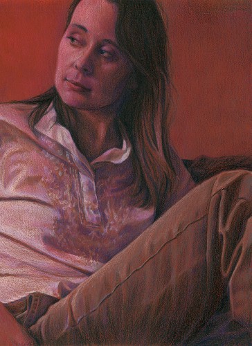
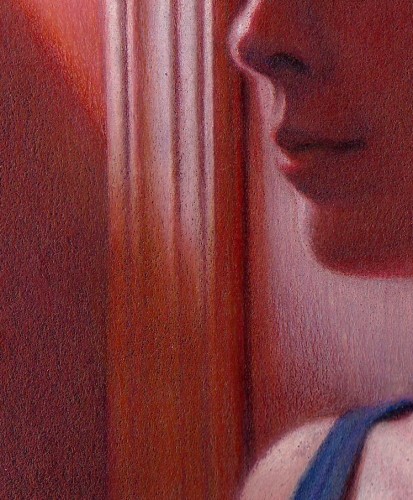
I completed my first piece on Light Blue Canson Mi-Teintes Touch, titled "Sunrise", using Prismacolor and Luminance colored pencils.  I really liked the color of the paper and decided to include a 1" border of bare paper around the piece, signing it in the border like I would a print.  I enjoyed working on the Mi-Teintes Touch.  The texture of the paper was prominent in the first few layers, and in a few places I let it show through heavily.  In other areas, such as the sunlit hair and window, I was able to saturate the paper with colored pencil and achieve a good range of values.  The grit was very even and allowed for nice, uniform layering and transitions of colors in the background.  I think the light blue color is a nice choice for portraits and figures - it has just the right mix of blue with a touch of green.  One other thing I liked about the paper: the weight.  At 353 gsm, it's a little more than 50 gsm heavier than Colourfix paper, and has a nice feel to it.  There's something about heavy art papers that I love.

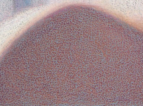
Here's a detail of the shoulder area, where I let plenty of the paper's texture show through:

A detail of the background transitions and texture:

And a detail of the hair:

Canson Mi-Teintes Touch

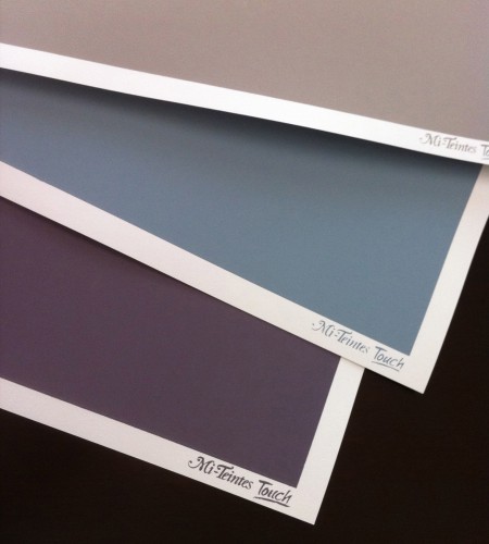
Everyone now and then I like to google "sanded papers" to see if any new products are out.  Most of my artwork is on Artspectrum Colourfix paper, with a few pieces on Pastelbord and Fisher 400.  I've tried UARTs and Wallis, and they didn't work for my style.  I've always liked drawing on the Canson Mi-Teintes papers in the past - especially the multi-colored tablets that give you a variety of hues - but these were textured (but not sanded) papers.  Some colored pencil artists (Sue Obaza comes to mind - check out her work in Strokes of Genius 2) do amazing things to bring out the texture of the Mi-Teintes paper; for me, though, I love the pumice in primer effect of Colourfix, and the speckled finish it produces.  You can imagine my delight when my google search found Canson Mi-Teintes Touch papers.  I had to order some! The Mi-Teintes Touch look and feel very similar to Colourfix.  There is a white, unprinted border around a colored, printed area which is toned with a fine grit sandpaper feel.  The available colors are many of the same colors in the usual Mi-Teintes line up (which is awesome!).  Here's my personal assessment of how they compare side by side with Colourfix:

  • Mi-Teintes full sheet sizes are slightly larger (22" X 30") vs. Colourfix's (18" x 27").
  • Dick Blick's website offered 14 colors for Mi-Teintes, vs. 20 colors for Colourfix
  • For the 3 sheets I ordered (Light Blue, Flannel Gray, Twilight) of Mi-Teintes, the colors were a little more vibrant and saturated than Colourfix colors, which tend to be subdued.
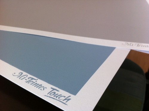
  • The Mi-Teintes papers have the "Mi-Teintes Touch" logo screen printed in the white border of each sheet, while Colourfix borders are unprinted
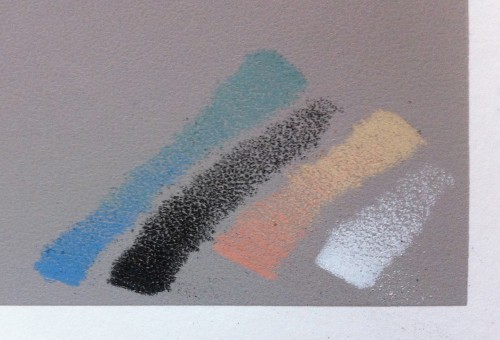
  • The tooth feels similar to the touch between Mi-Teintes and Colourfix.  A few test scribbles showed it to be slightly more prominent in the initial layers than Colourfix.
  • The most striking difference (and this is my biggest complaint about Colourfix in general) is in the overall quality of the screen print area.  The 3 Mi-Teintes sheets all had perfectly rectangular printed blocks of color, with no splatters, no chips, and no irregularities.  The color was uniform in each block.  Running my hand across the surface, the grit was uniform in each block.  From my experience with Colourfix, the variability is high both for consistency of grit and quality of the screen print area.  Some pieces of Colourfix have very little grit, and others are more like sandpaper.  Colors often have splatters and small voids.  The printed edge border is somewhat irregular (which I actually kind of like).  It has been frustrating to buy a pack of Colourfix paper and have every sheet have some type of printing defect, though.  It was nice to have 3 perfectly uniform sheets of Mi-Teintes.  I'll be curious to see if this is the norm with Mi-Teintes as I try more sheets.


Here's a few pics of the sheets and some test scribbles.  Now I just need to figure out what my first project will be!


Getting my geek on, round 3

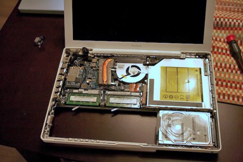
I remember when my wife and I first met:  She was a Mac, and I was a PC  We were like those commercials with the young, cool person seamlessly using the Mac while Jonathan Hodgetts fought with blue screens of death and system crashes.  After peering over her shoulder a few times as she typed away, I became entranced by the glimmering technology and the intuitive interface of her Macbook, and I was swayed over to the Mac side.  In 2006 I opened my newly ordered MacBook Pro, ogled over it's all aluminum body, backlit keys, and glowing white Apple logo when it was powered up.  It was love at first sight.  If this were a movie, this would be the cue for the montage scene of me and my Mac skipping merrily along together, eating cotton candy at a carnival, riding a two seat bicycle and being bestest buddies. At 6 years old the miles are starting to pile up, and the once gleaming shell has scuffs and scratches; the most used keyboard keys have the letter print worn away, and more than once I've needed to take the entire computer apart to replace a failed part, mostly notably the motherboard, which required a stripping of the computer to a bare, empty case.  Our feline friend, Iggly, has devoured several power cables.  The battery only holds about 10 minutes of charge, and the CD drive has given up the ghost.  When a recent buzz developed in the screen, I was slightly concerned, but when it stopped it was not a good thing, because the monitor went black.  A little trial and error showed there was only a narrow range of angles where the screen would now turn on.  It was maddening trying to type with the screen opened at a 35 degree angle!

You might think: time to get a new computer - those Macbook Airs look pretty nice - but...cut to the montage scene...me and my buddy, writing blog entries, editing photos which would later become artwork, Farmvilling....all those dings and scuff give it character.  It's like that well worn sweatshirt you had in college that has holes in the sleeve, but is your favorite thing to wear.  So off to eBay I went hunting.

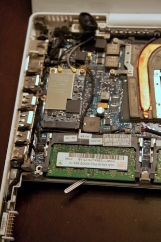
The offending part is the backlight inverter, which (surprise!) turns on the backlight.  The screen itself was actually still on - it's just that I couldn't see it because the backlight behind the screen was off.  In keeping in theme with Mac design, you must take apart everything to get at the inverter board, which is tucked right behind the MacBook Pro logo on the bottom of the display screen.  The hardest part of the job is not taking everything apart...it's taking everything apart without breaking any of it.

And, in the end, it all went back together again, and the screen is now on for a full range of angles, sans buzzing.  Me and my Mac are cozied up on the couch, happily typing this blog post ready for further adventures.  Yay!

Wilkes-Barre Fine Arts Fiesta

Every year in May we have a local art fair and competition called the Fine Arts Fiesta, which is a multi day event on Public Square in Wilkes-Barre.  There are bands, performing arts, vendors and food stands, adult and student juried shows, and plenty of people walking around and enjoying it all.  The past few years I've been submitting works for the adult juried show.  You really can't beat it, since the entry fee is only $9 for the first work, and $6 for subsequent, and they jury the works usually the day after they are dropped off (you don't submit slides - they jury the originals).  You can sell your work, or have it NFS.  At the end of the fiesta, you just pick it up - either right off the wall of the art tent (with a member of the art league there to remove it and verify that you're you), or at the drop off location.  There's the usual divisions for medium - painting, photography, etc.  There is not a specific colored pencil division, but instead I'm part of the Graphics category, which includes pencil, pen & ink and other graphics.  Awards include monetary prizes or gift certificates. This year I submitted "Hopes and Dreams", which is the drawing I did of Kiersten when she was 7 months pregnant (our daughter, Emma, is now 11 weeks old!).  I received a call from Gary at the Fine Arts Fiesta to inform me that my entry had won 1st place in it's category, Graphics.  The first place winners of all the categories are then judged, and a best of show is selected.  "Hopes and Dreams" won Best of Show!  The local newspaper, The Times Leader, called me, and did a short interview.  They're writing a piece on the Fine Arts Fiesta that will appear a week before the show, and a picture of my artwork with a quote will probably appear in the article.  This is my third Best of Show award from the Fine Arts Fiesta. The other two were for "Opaline Dreams" and "Bend", and I received 1st place awards for "Daydreams" and "Cascade" in previous years.

The show dates are:

The 57th Annual Fine Arts Fiesta on May 17, 18, 19, 20 2012, Public Square, Wilkes-Barre, PA. Fiesta Hours: May 17, 18, 19: 10 a.m.-8 p.m., May 20: 10 a.m.-6 p.m.  The awards ceremony is Thursday, May 17th @ 6:30 pm.

For those who are Facebook friends, you've seen a steady stream of Emma pictures; I'll include one of my favorite recent ones for those who aren't on Facebook:

Hopes and Dreams

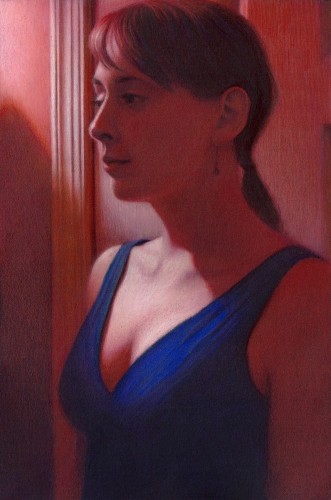
I started my latest drawing before the arrival of my daughter, Emma, and managed to squeeze in some time in the few delirious fleeting moments of free time afterwards to complete it.  Since I planned on entering it as this year's CPSA entry, one of the extra challenges I had was prohibiting myself from using Neocolor II washes to block in the initial colors and shadows.  Actually this was due to my confusion regarding the CPSA's recent rule change which classified Neocolor II crayons as not a colored pencil, making them ineligible as a component of a drawing for the Annual International Exhibition.  I wasn't confused about the rule, but had misread the announcement and assumed the rule went into effect this year, when actually it goes into effect in 2013. I actually could have used them this year for their final eligible show.  Oh well!  On the plus side, my recent entry into the Prismacolor tin contest, which had similar restrictions, egged me on to try and recreate some of the Neocolor effects (such as soft edges) just using blending of colored pencils.  I felt this worked well in this drawing in some of the transitions of the hair and shoulders into the shadows.  Another interesting thing about this drawing was that I purchased and used several of the open stock Caran d'Ache Luminance skin tone colors.  I really love them (although I don't love the price as much - expensive!).  I think they really helped achieve some of the glow you see in the face skin tones.  Now I just need to whisk the final drawing away to Lizza's Studios to have it professionally scanned, then enter it by the end of the month as my CPSA entry.

Favorite Baby Gizmos

It's amazing how quickly the nursery has evolved.  We thought it was fairly well stocked two weeks ago, but after putting it through its paces and several Babies R Us trips later, it's got plenty of new gear.  A few things have really proven to be invaluable, and I thought I'd make a small list of some of my favorites:

  1. Fisher Price Rock N Play Sleeper - Lightweight and portable, Emma naps in it downstairs with us as we go about our day.
  2. Swaddle Me - There's a bit of an origami like art to folding a blanket into a good swaddle, which is even harder with a squirming baby.  The velcro closures and custom shape of the swaddle me blanket makes life much easier.
  3. Itzbeen Timer - After the first few nights of trying to constantly reset the alarm clock in the middle of the night and do math to calculate the next feeding time, we got this timer.  There's a simple baby bottle button you press when you feed her, plus a diaper button for changing, etc.  You configure an interval for each, and it will alarm you when it's elapsed.  If you glance at it's backlit display, it will show time since the last event.
  4. Diaper Genie - Anything that makes managing the sea of poopy diapers easier is worth the money!
  5. Boppy - the boppy has many uses, but my favorite is as extra support to rest the baby when feeding
  6. Motion Activated Nite Lite - Not baby gear exactly, but I bought a couple and set them up in the hallways I travel to get from the kitchen to the nursery to the bedroom.  They're very bright and turn on automatically as I  walk down the hall.  Great when you're carrying a baby!


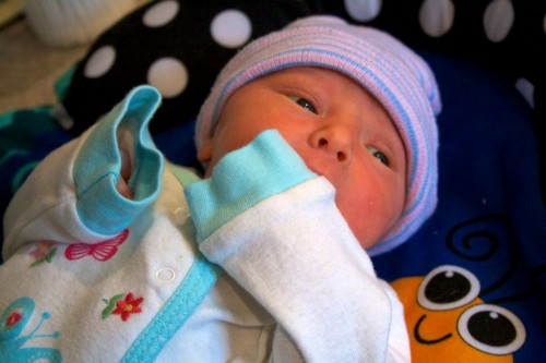
And, of course, I can't have a baby post without posting a baby picture, so here's a cute one from this week:

If Only I Knew an Artist

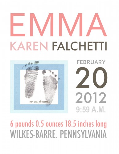
I love browsing Etsy (okay, shameless plug, I also have my own Etsy shop for selling prints).  Recently I bought three prints for our nursery there, and wrote this post about matting and framing them in my studio.  As I was browsing for those prints, one of the things which caught my eye were birth announcement prints.  Etsy has plenty of cute typography designs which list the details of when your child was born, birth weight, etc.  As my finger hovered over the click to buy button, I suddenly thought wait, I can do this.  It's funny how sometimes I completely forget I'm an artist, or that I was a graphic design major. After a couple of proofs and revisions, I printed and framed it yesterday, and hung it in the nursery.  By doing it myself, I was able to incorporate an actual scan of Emma's footprints inked at the hospital. Here's the final announcement:

Ready, Set, Go!

When Kiersten and I discovered last summer that we were expecting our first child, we set about learning everything that we could.  Before falling asleep each night, we read side by side in bed, Kiersten thumbing through a paperback of What to Expect When You're Expecting, and me reading The Expectant Father on my Nook. We perused The Bump and followed along with their checklists and suggestions.  Early on, we did an extreme baby room makeover of the den and spare room, creating a nursery and guest room.  By fall, I realized my two door, 6-speed manual bachelor mobile wasn't going to cut it as a baby mobile, hugged it goodbye, and traded it in for a new Honda CR-V.  The baby shower rolled around with it's dizzying array of baby gear, gizmos, and tiny outfits that made your heart melt.  In January, we completed childbirth classes, pre-registered with the hospital, and took a tour of the maternity ward. All in all, we were feeling pretty well prepared for our March 14th due date. Last weekend we felt restless and decided to focus on some of the final details.  On Saturday we installed the car seat in the CR-V, set up the plush rocker we bought from Babies R Us in the nursery, and I downloaded "Kiersten's Baby Mix" onto her iPod.  On Sunday night before going to bed we finished stocking the hospital overnight bag.  Since we were both off for President's Day, we stayed up late and went to bed around midnight.

At four am I was gently shaken awake by Kiersten.  Childbirth classes had coached us on the average times for the different stages of labor, as well as what week of pregnancy first time deliveries usually occur.  In reality, things zipped along much differently for us.  At 9:59 a.m. we had a baby girl, and we named her Emma.


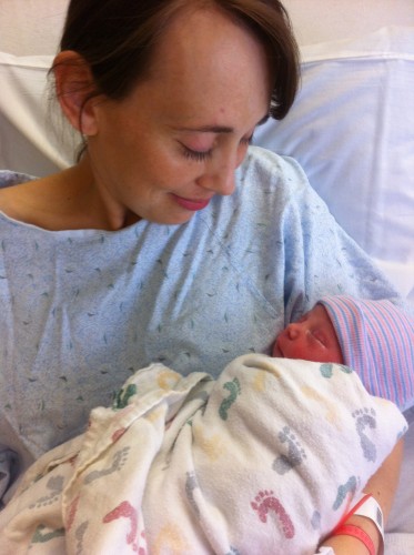
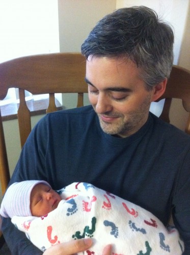
The past 7 days have been a single, long, wonderful day.  Day and night have blurred together; quiet times and crying times, sleepy times and cuddling times, lots of diapers and burpings, and mom and dad promising to take a nap themselves, always tomorrow.  In hindsight things didn't unfurl the way they were planned, but all the planning helped things unfurl a little easier.  Now, we've got a new book to read: What to Expect in the First Year.

Measure Twice, Cut Once

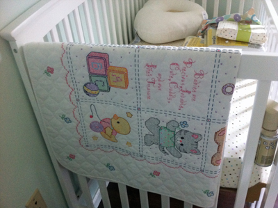
With only six weeks to go until the arrival of our daughter, the nursery is shaping up nicely.  After the baby shower in January, it's filled with baby gear: more types of blankets than I know what to do with; adorable hats with ears; changing tables and hampers, video baby monitors, and lots of tiny outfits.  I'm especially happy with all of the hand made items in the room:  there's the needlepoint blanket my mother made for us, the needlepoint prayer Kiersten's mother made for her nursery when she was a baby, some heirlooms from Kiersten's family, original artwork bought from one our of DC115 CPSA member's show (Nan Bozenka's beautiful cone flowers), and of course the room itself, which Kiersten and I laid the floor for with our own two hands.  

In keeping with the handmade theme, it was only natural to browse Etsy for some of the other decorations, and we settled on three prints by GalerieAnais.  The prints came as 8" x 10" prints, unframed, so I thought this would be another chance to put a personal touch in by framing and matting them in my studio.  When we painted the nursery, we didn't yet know the gender of the baby, so we chose a blue/green wall color.  Since learning we would be having a girl, I've been trying to sneak some pink into the decorations.  Because of this, I thought the prints would look great with a white frame, warm white outer mat, and pink inner mat.  Since I'm used to framing and matting my own artwork, I didn't think the double mat would give me too much trouble.  After spending the better part of a Saturday afternoon destroying multiple mats, I thought I'd write a post about some tips from what I'd learned.

Cutting double mats actually isn't difficult as long as you don't cut corners (no pun intended!):

  1. Step 1: Cut new outer edges on your top mat to ensure they are square.
  2. Step 2: Actually use the stops on your mat cutter to set the bevel cut distance.  This will ensure everything's parallel and at a set distance.
  3. Step 4: Cut the outside dimensions of the inner mat a little smaller than the top mat (about 1/2" smaller on each side).  This will ensure the only edges used for measuring and squaring will be the top mat's.
  4. Step 5: Stick the bottom mat to the top mat using double-sided tape (with the cutout still in place) .
  5. Step 6: Increase your mat cutter stops by the inner border thickness, plop your taped mat in place, and cut the bevels for the inner mat.  Ta-da! The taped together cutouts should fall out.  Everything will be perfectly aligned, centered, and at uniform thickness.

So, you can probably guess that I did the opposite of almost every step the first two attempts, before doing it the right way.  The main two places I went awry were assuming my staring materials were square, and not using my mat cutter stops (instead, I drew lines which ended up being non-parallel).  When you only have a 1/4" inner border, even a small degree of non-squareness will result in a visually noticeable thin border at one end of the cut which fattens up at the other.  Anyway, thought I'd share my experience - maybe it will save someone else a little frustration when cutting double mats!

Here's the final piece, framed and matted, on the wall in the nursery (the artwork in the picture is by GalerieAnais on Etsy):


The Red Room, Revisited

Prismacolor is hosting a contest on their Facebook page, where the grand prize winner may have his artwork appear on one of their 2012 tins. I decided to create a piece specifically for the contest.  A few years ago we did a makeover on a small room in our house, converting it to a den.  The walls were painted a rich terra cotta color, and one of the lamps was red stained glass.  I nicknamed it "The Red Room", and did a piece called "In the Red Room" (12"H x 9"W Prismacolor pencil on red Artspectrum Colourfix paper, 2007).  Earlier this year I was thinking about some ideas for pieces and took a few photos for some poses, and one of these became "The Red Room, Revisited" (15"H x 10"W Prismacolor pencil on black Artspectrum Colourfix paper, December 2011).  Here's a picture of both pieces side by side:

One of the main differences between the two pieces is color intensity.  In the earlier work, I used the red of the paper with some of the darker red and purple colors (terra cotta, black grape) and grayed lavender for the whites.  In the newer piece, I used a fuller range of colors, with complements set side by side.  For example, the reds contain: terra cotta, burnt ochre, parma violet, lime peel, mineral orange, poppy red, and dioxazine purple hue.  Another difference is that last year I was working with Neocolors quiet a bit, and liked the soft edges you could achieve with them.  For the contest, you could only use Prismacolor pencils, but I was still able to create some soft edges only using pencils.  I tried to soften details in shadows, while tightly rendering items in bright light.  A few detail shots:

As an aside, I'll register the standard artist disclaimer that the scan is quite dark and doesn't show all of the colors in the shadows.  Maybe someday I'll figure out the right scan settings to get a good reproduction!

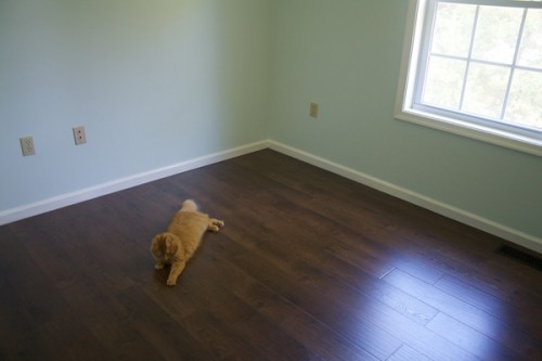
Incidently, these are the last red room drawings because we deconstructed the red room earlier this year, painting the walls blue and installing a dark laminate floor as we converted it into a nursery.  Maybe I'll have a new series, "In the Blue Room"?

Merry Christmas 2011

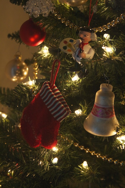
Our Charlie Brown Christmas tree is getting ready to be filled with presents.  We have many favorite ornaments, including this little painter guy.  I'll bet he's hoping that giant stocking underneath him gets filled with art supplies!

Baby on Board

For those who haven't seen the Facebook posts, Kiersten and I are expecting a baby, due March 2012. We've been frequenting The Bump website, and I liked their countdown tickers and thought I'd post one on my website.  We're a little more than halfway there! Pregnancy Ticker

Getting Caught Up

The past weekend I decided my blog wasn't getting much TLC.  It's actually 5 years old this year, and has had tweaks and upgrades here and there, but on the most part it's looked pretty much the same and hasn't used all the latest bells and whistles of Wordpress.  It started innocently enough: add some snazzy thumbnail previews to my posts.  This involved modifying code, which, like most of my Wordpress tinkering, resulted in a subsequent run of days where visitors were greeted with "error!" and a white screen, instead of an art blog.  After much hair pulling, I discovered the offending piece of code was one single space (ah, computers are great that way).  Anyway, along the line I started thinking about how my blog is different than my Facebook page is different than my portfolio page.  I tend to use the blog a little more like a diary, with posts including everything from how the cat ate my latest computer cord to photos of the pumpkins we carved for Halloween.  It made me want to change the look of the blog, and I stumbled on this diary theme.  I'll try it out for a while and see if it fits - kind of liking it at the moment.

Getting my geek on, round 2

A few months ago my trusty MacBook's motherboard fizzled up in smoke.  I vividly recall staring in disbelief, poking at the keyboard with one finger, staring in disbelief again,  cursing the computer gods, pouting, going through the stages of denial, getting a repair quote,  scheming how not to pay the repair quote but instead fix it myself, stalking Ebay, cackling as I tried out all 24 bits of my new precision screwdriver kit, and, amazingly, actually repairing it.  All in all, a great experience. So, this past Saturday when Kiersten announced that she saw a spark when disconnecting the magsafe powercord from her Macbook, I initially envisioned "static charge type flash".  It wasn't until she replicated it in front of me that I realized it was "Fourth of July big finale!" type of flash, complete with burning smell.  It looked like a bad special effect from a 50's sci-fi movie, like one of those toy plastic ray guns that spews forth a shower of sparkles as you crank the handle.  That's not good.  Using my awesome powers of deduction, I concluded, "Magsafe adapter....baaaaad."  Being very experienced at the replacement of magsafe adapters due to the voracious appetite of a certain orange furball who co-resides with us, we quickly logged onto Ebay and ordered our favorite discount version of it.  Then I offered to share my power cord with Kiersten.  She popped it onto her computer, and instantaneously we were greeted with Gzaaap...sparkle sparkle sparkle! and the smell of more things burning.  We both stared for a second, then I said, "I'd like to revise my theory."

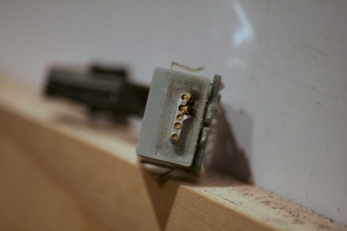
A quick inspection showed the port itself was damaged, with two of the power connectors pulled out and partially melted.  Some Googling showed Macbook innards, and that the part could be removed just by unplugging/unscrewing it (once you surgically removed everything around it), and, amazingly, could be bought for $29.  The engineer in me excitedly rushed to dust off the precision screwdriver kit.

And, in the end, it worked.  There may have been an extra screw left after I put it all back together.  But I'm sure it wasn't to anything important.

CPSA 19th Annual Exhibition

"Daydreams" has been accepted into the CPSA 19th Annual International Exhibition.  This year the exhibition will be hosted at the Charles W. Eisemann Center, 2351 Performance Drive, Richardson, Texas.  Show dates are June 29 - July 31, with the artist's reception on July 16th. This week I also received notification that "Daydreams" was juried into the 2010 Wilkes-Barre Fine Arts Fiesta, and won first place in its category, Graphics.  The fiesta dates are May 19th - May 22nd.

Lizza's

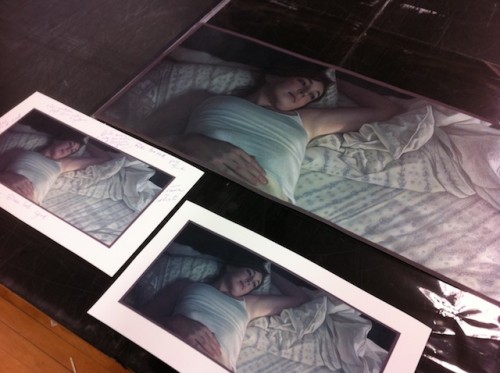
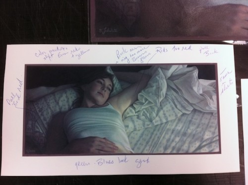
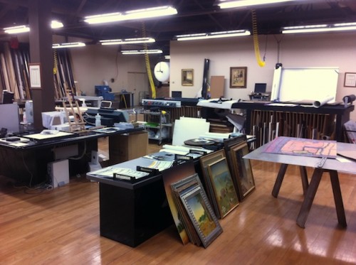
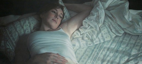
Today I finalized the proof of "Daydreams" at Lizza's Studios.  I've been selling prints of some of my work for a while, and Lizza's always does the scanning and giclee prints for me.  Additionally, I use their scans for my CPSA show submissions, since their professional scans look 1000% better than what I can accomplish with either a photo or pieced together scan on my home computer. They own a Cruse CS285 ST scanner, which is larger than a pool table, and after scanning they work with me to meticulously color match every area of the print.  When I first started working with them, it usually took three to four proofs until a perfect match, because the sandpaper texture of my paper combined with the high glare of the fixative created some interesting challenges.  Now, they've become experts at scanning my work, and it will either be perfect on the first shot, or require only one markup.  Once I frame the print, usually the only way I can tell it from the original is by tilting the drawing and looking for the 3d bumps of the sandpaper grit; otherwise, it fools even me!

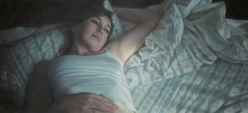
Daydreams - Completed

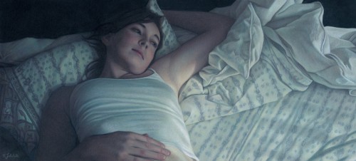
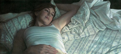
Today I completed "Daydreams", 12"H x 26" W on Aubergine Artspectrum Colourfix paper.  Pencils used were mostly Prismacolors, with also quite a few Derwent Coloursofts, and Neocolor IIs used sparingly for the black areas.  All of the crazy fabric folds weren't the hard part - I love drawing fabric; it was the sheet pattern which gave me the most difficultly.  I think the hardest part of the pattern was figuring out where to suggest it, and where to actually render it.  I was worried that if it was too tightly rendered, you might end up looking at it instead of the figure.  The other challenge was keeping the piece from turning too monochromatic.  With the picture reduced on the webpage here, the sheet and shirt colors fuse in grays, but in reality they are layers or warms and cools.  Next, I'll take the piece to Lizza Studios to get it professionally scanned, and then size it as my entry for this year's CPSA show.

Work in Progress - Feb 6

This weekend I turned a corner on the picture, and hit the point where everything is drawn and I can focus on pushing in color and building value.  The pattern on the pillow is still giving me trouble, but strangely the pattern in the sheets is coming together on its own.  I decided to hit the piece with a layer of fixative before continuing work early today, because it was getting pretty waxy and difficult to see how dark some areas were.  I'm always a little nervous about doing that too early, because the paper becomes slicker overall, but it seemed to work okay.  I also encountered the usual paradox where my darks didn't seem dark enough, but in actuality I needed to make all of my lights lighter.