Work in Progress - November 26 2013
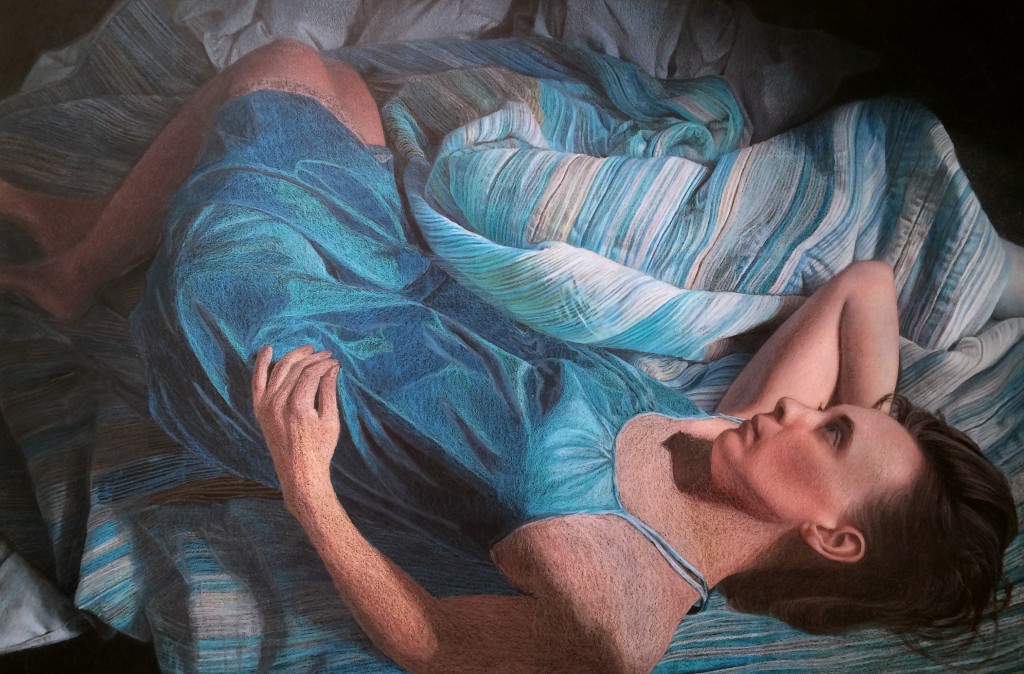
Several more hours of work, and I've begun refining some of the blanket folds, working all around the piece before moving into some fine detail on the right side of the blanket. I have to admit, at times I feel a little over my head working the blanket pattern, and I just need to take a break from it. During those breaks I've started working the skin tones for the legs, right arm, and head. I'd just like to say that I love the Caran d'ache pencils for skin tones, mainly because several of their colors are skin tones, and you don't need to create them using the familiar pink-orange-yellow layering. It certainly speeds up things. Now that I've put the Caran d'ache through their paces, here's a few observations:
Caran d'ache Luminance pencils (76 color tin):
- Superb quality control. All leads perfectly centered, pencils sharpen well, points don't snap.
- Pencil diameter is slightly larger than standard. If you have an adjustable pencil sharpener, no problem (on mine it is one click bigger than standard). On my old Xacto sharpener, which was not adjustable, I couldn't fit the pencils in without jamming them with force.
- Pigment feels "drier/more powdery" when applied, especially to sanded paper. It lays down evenly. "Less waxy" is perhaps more accurate. Leads feel harder than Prismas, but not as hard as Prisma Verithins.
- Different colors have different hardness/waxiness. This is the case for all colored pencils I've used, regardless of brand. You just get to know the feel of different colors.
- Expensive! Okay, I knew that before starting, but yikes! I'm on my fourth refill of some colors already for this picture, at $4.03 per pencil open stock
- A bit hard to reorder. No one sells them locally, and even ordering them online via Dick Blick periodically has colors out of stock, which can bring working on a piece to a standstill
- Colors in the 76 pencil set were well chosen and compliment each other nicely. You could almost grab random colors from the set and still have a nice color harmony, because the colors are a bit subdued. The set is very heavy in blues, grays, and fleshtones, so it is perfect for me. It's a bit sparse on greens and reds, though. I feel I'd need to supplement the set with other brand's pencils if I were working with those two colors.
Here's a snapshot of the work in progress. My next steps are to finish the skin tones on the upper body, and continue refining the upper blanket folds moving right to left.