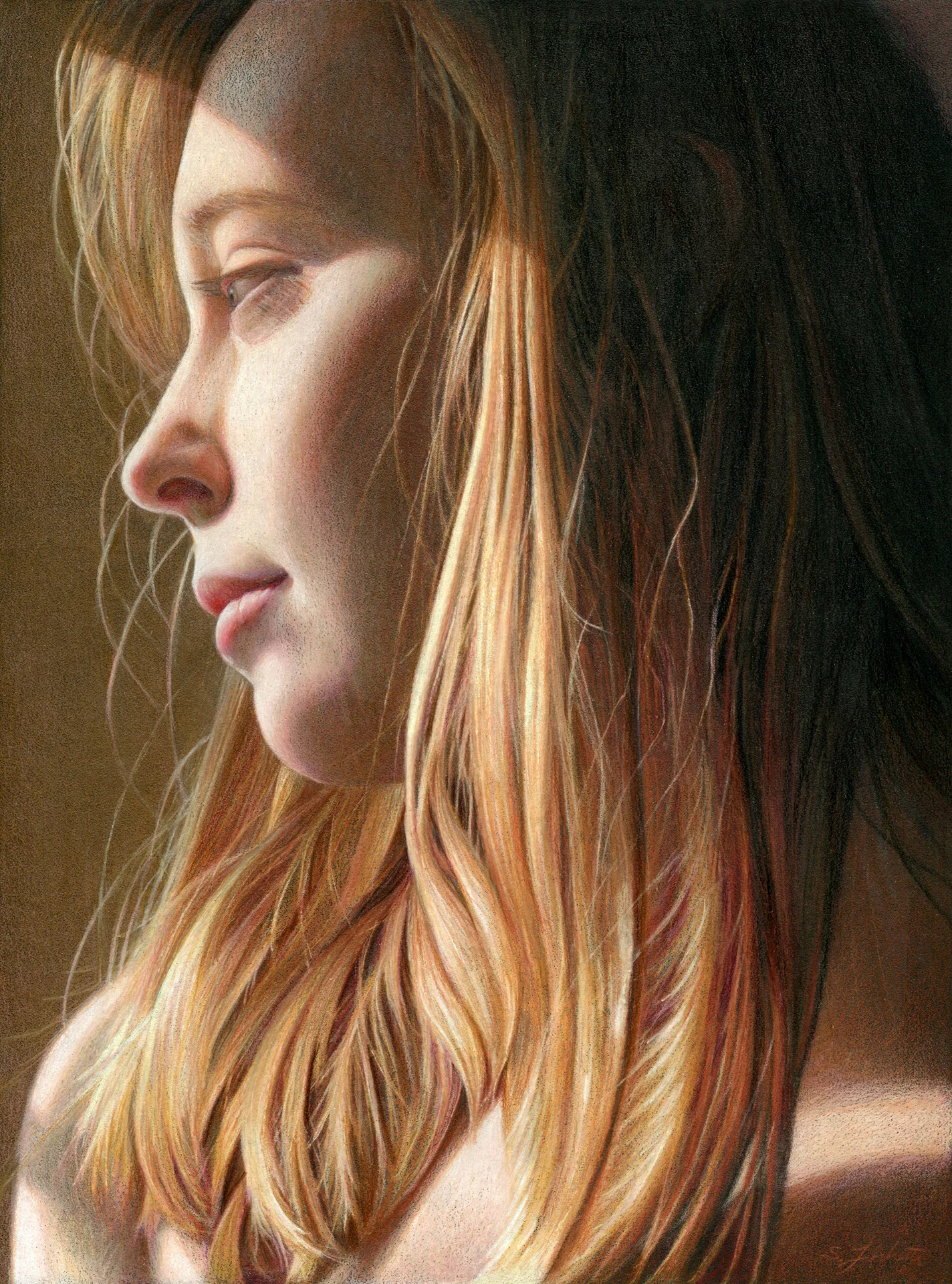
"Shine" has been accepted into the CPSA 25th Annual International Exhibition in Bethesda, MD. Show dates are June 10 - Aug 6, 2017 at the Mansion at Strathmore.
If you've attended the CPSA Annual International Exhibition, you've experienced the lull on Saturday after the morning trade show but before the late afternoon artist's reception. It's a good time to group up with friends for lunch at a local eatery. A few years ago I was wandering past the convention's conference room on the way to my hotel room when I heard some familiar voices. Peering inside the entrance, I saw a round table of listeners with Elizabeth Patterson speaking. She was telling the story of her career, with all of the twists and turns that led her to where she was today. It was fascinating, a mixture of hard work and sometimes being in the right place at the right time. Lately I've been working on a non-art related bucket list project: writing. If you've read my blog, this shouldn't come as too much of a surprise, because I do love to write. But, it's been overwhelming trying to determine where to start, so I thought I'd look at how things progressed with my art career.
There's a popular meme which compares plan versus reality. It shows the plan as a straight line connecting two dots. Reality is a spaghetti-like connection. That seems accurate:
- 1999: I live in a small apartment, and search for something less messy than oil paints. I discover Ann Kullberg's Colored Pencil Portraits Step by Step
, and I'm awed at what colored pencils can produce. I buy a 120 pencil set of Prismacolors and a few sheets of Stonehenge paper.
- 2000 - 2003: I complete a few portraits for friends using Ann Kullberg's techniques.
- 2004: A local book shop hosts the Pennsylvania CPSA chapter DC115's member show. I happen to be at the book shop perusing art books, and meet MaryBeth Lesko, DC115 president. I join CPSA. When they have their first member show, I am nervous about dropping my artwork off for the show because I'm worried it isn't good enough to display. I take a workshop led by Jeffrey Smart Baisden.
- 2005, 2006: I submit pieces to the Annual International Exhibition, but they aren't accepted. I peruse the online art forum, Wet Canvas, and discover some members are on a pencil drawing website called ScribbleTalk. I join it. As I produce more work, I begin posting it for feedback on ScribbleTalk. It also opens my eyes to many different types of supports and approaches. I discover textured paper (Colourfix) after seeing Nicole Caulfield's work on Scribbletalk (thanks, Nicole!).
- 2006: My first work on textured paper, Blue Nude, is accepted into CPSA Explore This! 4. During this same year I notice many of the people on ScribbleTalk have Wordpress blogs, so I create a blog and start posting work.
- 2007: My first acceptance to the CPSA Annual International Exhibition. I'm incredibly excited. It's a major goal of mine to get a piece into the annual show. It's my first time meeting many of the ScribbleTalkers in person. I find a local scanner/printer, Lizza Studios, and begin selling prints of my work directly from my website. I notice some of the ScribbleTalkers are using Neocolor II crayons (thanks, Ranjini!), and experiment with them.
- 2008: After a DC115 group show, the gallery owner offers me a solo show. I sell my first original. My second acceptance in the Annual International show. I lead my first workshop as an instructor, and give a talk at my local art league.
- 2009: Signature Status for my third CPSA acceptance. The same piece, Crescendo, is a finalist in the Artist's Magazine Annual Competition.
- 2010: Second solo show, at Paper Kite Gallery. In a conversation with CPSA DC115 member, Susan Obaza, she asks why I don't submit to the Strokes of Genius books. I start submitting the following year. I create a Facebook page for my art.
- 2011: 5 year merit award with CPSA. Opaline Dreams appears in Strokes of Genius 3. Somewhere near this time CPSA excludes Neocolors from the annual show, and I need to adjust my approach to work without them.
- 2012: What a year! First, my daughter, Emma, is born. Daydreams appears in Strokes of Genius 4, and the Artist's Network posts it on their website for the book blurb. Colored Pencil Magazine asks me to do an article on the making of Daydreams. While perusing Dick Blick's website I discover Canson launched a new textured paper, Mi-Teintes Touch. I write a blog post reviewing it and, much to my surprise, Canson emails me a few days later and tells me they read my blog post. They hire me to do a freelance project creating artwork for a flyer advertising colored pencil on Mi-Teintes Touch. The Artist's Magazine contacts me and asks if I'd like to be featured in an article about colored pencil artists. Personally I think this was a series of fortunate events building off each other, exposure creating further exposure. I should note my entry into the 2012 CPSA Annual show was not accepted, although it would be accepted the next year in 2013 (different jurors each year - that's how the show works).
- 2013: In terms of drawing frequency, I slow down quite a bit after Emma's birth in 2012. The Artist's Magazine article is published in May 2013, and Hopes and Dreams is accepted in the CPSA show. Drawing Magazine contacts me and asks me to contribute to an article on colored pencil, using Cascade.
- 2014: I create an Adobe Behance portfolio. I suspect this is how PencilKings found me. They hire me to create instructional videos for colored pencil. Colored Pencil Magazine contacts me for an article, and uses Adrift for the cover. North Light Books uses Adrift for the back cover of Art Journey: Portraits and Figures. Adrift is a finalist in the Artist's Magazine Annual competition, and the Artist's magazine asks me to be a spotlight artist in 2015.
- 2015: I notice that some of the places I've worked with (Colored Pencil Magazine, PencilKings) are helping me with promotion by reposting some of my Facebook updates for new works. Ann Kullberg's magazine includes one of my works in their Showcase section.
- 2016: I post my drawing of my daughter, Emma, 3, on my Facebook page and it is reposted by Colored Pencil Magazine. Many of their followers repost it as well, and it goes viral. In the course of a few days my Facebook page doubles fans from 250 to 500+.
 , and I'm awed at what colored pencils can produce. I buy a 120 pencil set of Prismacolors and a few sheets of Stonehenge paper.
That's it! Seventeen years of scribbling. A few observations from all of this:
- Where my base came from: Other artists. Early on it was people I met on ScribbleTalk, and then in person at the annual shows, plus connections through the CPSA district chapter. At my first national show, MaryBeth Lesko walked me around and introduced me to everyone (plus, I had a list of people I wanted to meet).
- Things that I thought might have a big impact, but didn't: Magazine articles
- Things that didn't work: In general, anything that involved trying to sell work to strangers over the Internet. Every print or original I've sold has been to someone I met in person, and the person has seen the original hanging on a wall.
- Things that did work: Getting to know other artists and becoming part of a community. Getting involved in the local art scene via the art league, local art contests, and local gallery venues.
I don't have gallery representation, and I haven't pursued it, so I can't write about that experience. Elizabeth Patterson's story, though, has lots of detail about her gallery experience. If you bump into her, ask her about it.
Hope this helps, or at least is interesting. I'm trying to sort it out to see how it can help me get going with my writing.
Lastly, if you'd like to follow my fiction writing, give a Like at my Facebook page for it. I regularly post updates about my writing journey there.
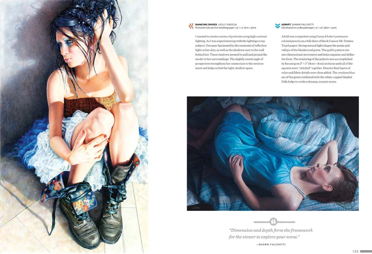
"Adrift" appears on page 123 of Strokes of Genius 7: The Best of Drawing; Depth, Dimension, and Space (North Light Books, 2015). I'm excited that my work appears on the same page as Holly Siniscal's "Dancing Shoes". I'm a fan of Holly's work (and just missed owning one of her originals in a bidding war at the CPSA silent auction). Copies of the book can be ordered from North Light Books online store.
I created as short time lapse video of the work in progress photos from "Daybreak". You can see my process for this piece was:
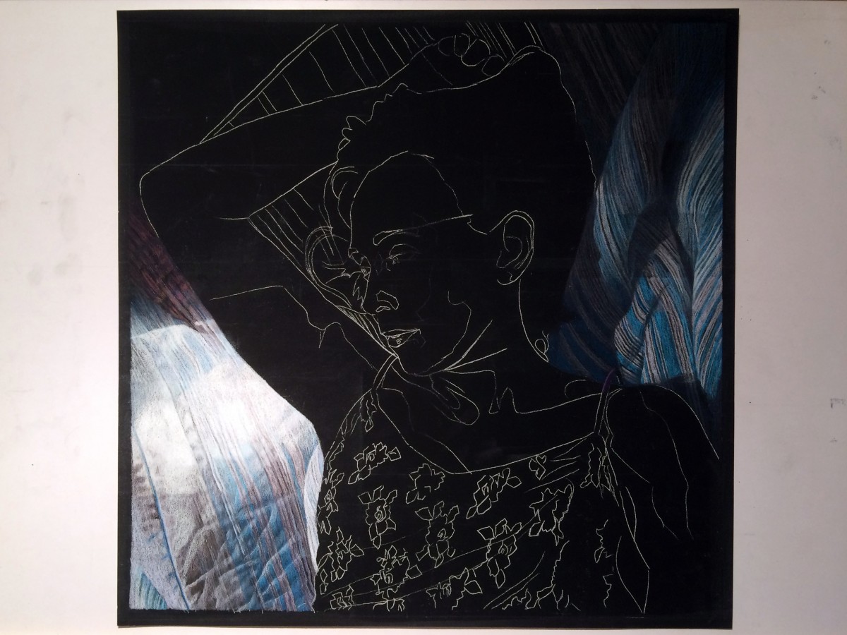
- White line drawing on black paper
- Foundation layers for the background
- Worked the skin tones from brightest to darkest areas
- Worked the shadows
- Brought up the lights and refined the fine details
Thanks for watching!
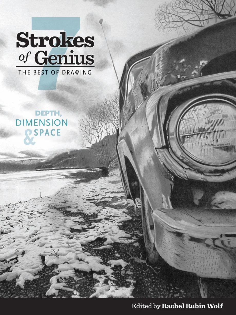
Strokes of Genius 7 will be released in November, and can be ordered from the North Light Books store or Amazon. My work "Adrift" appears in it (that piece seems to be popping up everywhere lately).
My work "Adrift" will be featured in the "Competition Spotlight" section of the October 2015 issue of the Artist's Magazine. "Adrift" was a finalist in the 2014 Artist's Magazine annual art competition. It's an honor to be selected for the competition spotlight (and I'm always particularly happy when a colored pencil piece is selected in an all media competition), so be sure to check out the October issue.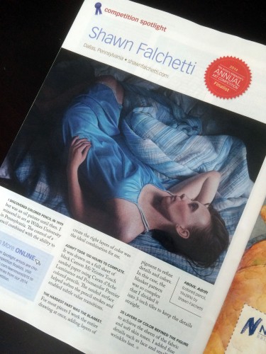
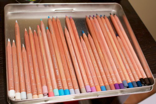
With a few days off for the holidays, I sharpened my pencils and began a new piece. The cropping is a perfect square (20" x 20"), and I am working on my favorite paper, black Canson Mi-Teintes Touch with Caran d'ache Luminance pencils. As usual, I started with my swatches:
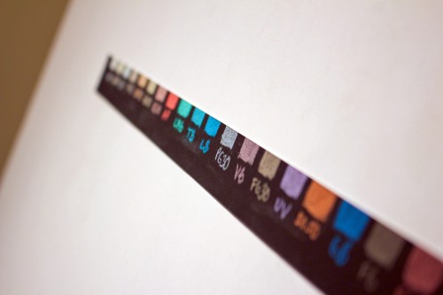
then placed my selected colors into an empty tin to form my working palette:
The work is a follow-up to "Adrift", and uses the same blanket pattern, although a different lighting setup. The blue satin nightgown (which was so much fun to draw) has been replaced with a purple floral lace top (which will be a challenge I'm looking forward to drawing). I'm about 8 hours into the piece, working on blocking in the blanket details. The blanket probably looks refined at this picture's resolution, but it is not - if you could zoom in you'd be able to see many areas have solid colors where stripes will need to be added, and other areas that have stripes need their values developed. After the blanket background is complete roughed in, I'll move onto the skin tones. In this piece, sunlight is directly falling on the figure's face, so the warm colors should be a nice juxtaposition with all of the cool blanket tones:
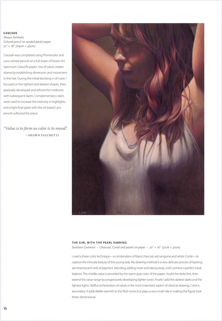
I received my hardcopy of North Light Books Strokes of Genius 6: Value | Lights & Darks. Cascade appears in the Portraits section on page 16. Please visit North Light Books online shop if you'd like to purchase a copy.
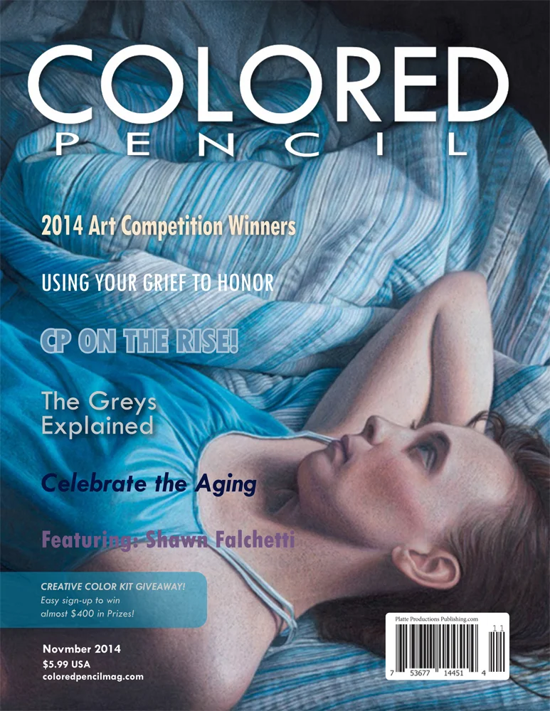
I'm honored to be the featured artist in the November 2014 issue of Colored Pencil Magazine, and my piece, Adrift, appears on the cover. The issue features a four page article which includes a step by step sequence for the making of Adrift. Please visit www.coloredpencilmag.com/issues to purchase digital or hardcopy issues.
Each year the CPSA national show is hosted by a different gallery. It's been fun traveling around the US for the shows over the years, visiting places like San Francisco, Washington DC, Seattle, Cinncinati, and Daytona. Artists ship their artwork about a month before the show, and CPSA hires a cartage company to manage unboxing and handling of the 120+ works. Since the cartage company must physically be located near the gallery, a different one is used every year. I received my first hint that something was up when I logged onto my computer a few weeks ago. A few dozen emails from the colored pencil artists Facebook group were in my inbox, and growing. The hot topic was triggered by the return shipments of our artwork from the Daytona show. Works were arriving back with stickers applied to the front plexi of the piece.
The mishap seems to have occurred due to good intentions. At the Daytona show, the gallery placed stickers with the artist's name and work title on the gallery wall beneath the piece. If the piece won an award, they placed a second sticker with the award information as well. I can guess that the person from the cartage company thought the artists might want their show stickers and stuck them to to the plexi. He probably didn't realize that they would be extremely difficult to remove.
Sure enough my piece arrived with both stickers on the plexi:

At the show I noticed some wax bloom developing on the legs in the drawing, and planned to take apart the frame when it arrived to fix it. The presence of the stickers didn't upset me too much since I thought it would be easy enough to remove once the plexi was out. With a little effort I removed the hanging hardware, dust jacket, framer's points, and finally the artwork:
I read about various approaches to removing the stickers, and decided to go with the least aggressive: good old soap and water. I filled up a utility sink with hot soapy water and let my plexi soak in it for a few hours. i was tempted to light some scented candles and play some spa music to complete the experience:

And several hours later:

Hmmm. Okay, on to the aggressive methods. Surprisingly the best thing for removing adhesive without damaging the plexi is WD40, although getting the WD40 residue off afterwards is difficult. As I am scrubbing away to remove the residue I juggle the plexi, drop it, and irreparably gouge it on a sharp edge on my work table (I really should have put a towel under it to protect it from scratches). Not a little gouge, but a Grand Canyon sized crevice. Since there's no fixing this, I make the phone call to my framer to order a new piece of plexi.
In the meantime I check out the wax bloom. You can see it as a light gray on the outline of the left leg. I find that they darker Prismacolor warm grays are prone to bloom, and this is an area where I outlined the legs before laying down color. It's bloomed pretty good.
Fortunately this is easy to correct with a slightly damp cloth, followed by a layer of fixative. I don't particularly want to pull the entire mat apart, so I mask it off with paper before spraying the fixative on the artwork:

It takes about a week for the plexi to come in. It is just as expensive as the first time I bought it (doh!). I peel off the protective paper, carefully (!) lay it into the frame with a towel underneath, then pull out my handy point gun and set the framer's points (as an aside, you can set points without a point gun, but seriously, if you do your own framing splurge for at least a cheap one. It takes me abut 20 seconds to put all the points back in on this piece).
My framer used brown craft paper for the original dust jacket, but I usually use Lineco frame backing paper, so I cut some for the replacement before reattaching the hardware.
CPSA published a note to the artists indicating they were compiling an artwork handling guideline list for future cartage companies. I think this is a good step, and will help. I think some artists are seeking damages from the cartage company, but I am not (the sticker was easy to remove with WD40; the damage was my own fault, and I had to take the plexi off anyway to fix the wax bloom). Live and learn!
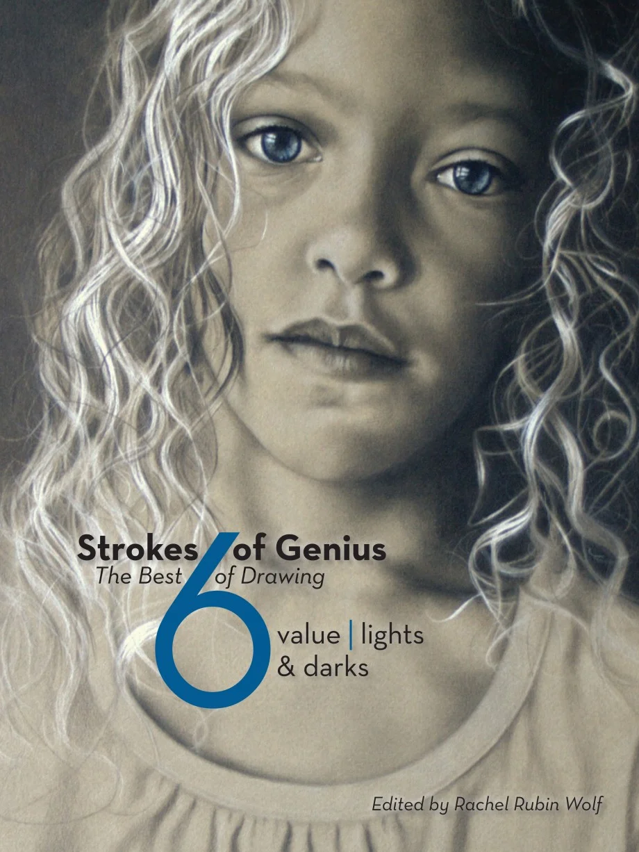
North Light Books Strokes of Genius 6: Lights and Darks will be available 10/23/14, featuring artwork by many of my favorite colored pencil artists. My work, "Cascade", appears in the book. Visit North Light Books shop here: http://www.northlightshop.com/
One of the many perks of being a member of the CPSA is receiving their magazine To the Point. In it, you'll find photos of all the pieces in the Annual International or Explore This exhibition, and, tucked away in a table you'll find the statistics showing what types (landscape, portrait, still life, etc) of pieces were accepted into the show. I've always been a little curious to compare that table to, say, a corresponding table from the Pastel Society of America or Oil Painters of America and see if the split is similar, or if there are subjects that colored pencil artists tend to gravitate. One of the other things I've been curious about is the CPSA awards summary: are there certain subjects that tend to be more represented with awards? First stop is the CPSA website, which lists all awards with photos for each year. I've focused on the Annual International show for this exercise. CPSA doesn't assign a category to each piece, so I make up my own. This turns out to be a little challenging: is Scott Krohn's self portrait assembled out of stones a portrait or a still life? Hmmm. To get warmed up, let's start with something easier: how many awards were there each year, for the last 5 years? [ws_table id="1"] The number of awards has decreased. Keep in mind the awards have sponsors, and sponsors change over the years. If you look at the cause of the decrease:
- Named awards decreased from 6 to 4. The CIPPY, Prismacolor and Dixon Ticondara awards are the only 3 of the original 6 named awards remaining, but the CPSA District Chapters award introduced in 2010 makes the 4th.
- Awards for Excellence decreased from 9 to 5
- Awards for Outstanding Achievement decreased from 7 to 3
- 3 intermediate awards between Excellence and Outstanding Achievement were created in 2010, the Award for Outstanding Recognition
- Even though there are less awards, the cash value of the top prizes increased. The CIPPY awarded $2500 in 2009, and $5000 in 2014. The total value of awards in 2009 was $16,200 and in 2014 was $15,200.
Personally, I prefer fewer awards with the higher value for the CIPPY. I like the Best of Show to win the big prize, and with typically 125 pieces in the show, 15 awards seems like the right number. So, next question is what subject matter tends to win the most? [ws_table id="2"] This table represents the same year range, 2009-2014, as the previous tables. Not too surprisingly, "Still Life" is first, and "Portrait" is second, as these are traditional major categories of subjects. If this were an oil or pastel contest, you might expect the third major category, "Landscape" to appear next, but it is relatively low on the list with only 3 awards; instead, "Animal/Wildlife" takes the third major spot. "Urban Landscape" (city scenes, street views) is next, mostly composed of works by Elizabeth Patterson and Jeff George, followed by "Floral", then we're into subjects with 5 or less (1 per year). A few observations:
- Allegory/Narrative, which I think appears often in oil painting works, did not appear often in the CPSA shows. The only 2 I put in the Narrative category were both of Joseph Crone's superb black and white film noir scenes
- Whimsical is a category I made up for illustrative/wondrous works. It's dominated by Paul Van Heest, who received 4 of the 5 awards
- Nude, another traditional painting category, received only 1 award, Elisabeth Ehmann's traditional and beautifully drawn female nude
- No awards for Abstract works
- Satire appears only once, with Philip Carpenter's "Art in America"
Lastly, I've heard people comment that the same people always win, so let's see how the numbers look. There were 6 shows between 2009 and 2014, so the best result an artist could get is an award at each show (6 awards). Here's the actual counts: [ws_table id="3"] Most (74%) were single show award winners, and no one received an award at all 6 shows. Another way to think of it is to envision being one of the 15 award winners. It's the Awards Banquet, they've just called the winners up to take their seats, and you sit down and look around curiously at the other 14 people, wondering what they'll win, and if they've won before. Odds are:
- This is probably your first award, and the same is true for 10 of the other people around you
- 3 people probably received one other award in the past 5 years
- At this point, you + 10 people + 3 people = 14 of the 15 people seated.
- The last person is probably familiar with his or her seat, because he or she has won 3 awards, and this will be his or her fourth
- You and everyone else have an equal chance of winning Best of Show. The number of first, second, third, and fourth time award winners receiving the CIPPY was about the same.
There you have it! Fascinating stuff. Now that we've covered the numbers, I'll give a few non-number based thoughts: I don't think some subjects are more likely to get awards than others; I think that colored pencil artists tend to work in some subjects more than others. Personally, I find landscapes particularly more difficult in colored pencil than figures, for example. Similarly, the lack of Abstract awards is because there are few Abstract entries (note there were other shows outside of the 2009-2014 range which had Abstract awards). I think concept is more important than subject, and usually the pieces which are top winners evoke some type of reaction and connection when you see them (particularly full scale, in person). When I saw Jeff George's "Life and Death" CIPPY winner at the 2009 show, I wasn't walking away thinking about the technical aspects of the work, I was thinking about the work, and what it said. I was mulling over mortality and this cross section of strangers, the awareness of all the similar crowds we walk through, oblivious of the lives that continue on and the others that don't. I thought about it after I had left the gallery. I imagine this is what the juror reacted to as well, much more than the composition, color, and rendering of the people (which was also expertly done). Regarding the number of repeat winners, I was surprised by the actual numbers. I thought most (more than half) would be repeat winners in the 6 show study, but actually nearly 3/4 of people were first time winners - pretty much the opposite of what I expected. Strangely artists that I thought always won would actually win an award one year, then win an award 5 years later. It's funny how your perceptions can skew reality. Well, hopefully this wasn't too much math, but instead some food for thought. Enjoy!

Alrene Icarus Demo

Silent Auction
Last week I hopped on a plane and flew to Daytona Beach, Florida. A short taxi ride from the airport deposited me at the Daytona Beach Resort, which was home to the Colored Pencil Society of America's 22nd Annual International Exhibition convention. Thursday afternoon: My first stop was the CPSA hospitality suite. There you sign in, pick up your name tag and a bag of art swag packed with goodies. The room has displays by the hosting chapter, as well as a preview of all the raffle prizes that will be given out Thursday night. Often, artists are sitting at tables giving impromptu demos, and this was true when I arrived: Arlene Steinberg was showing how to use the Icarus board to create vibrant colors. This was timely, since on Friday night her piece in the show (which was drawn on an Icarus board) would win a high award: Thursday evening: Thursday is a fun night at the convention. For starters, each show entry (regardless of whether it made it into the show) is projected and the title and artist's name are read. If you didn't make it into the show this year, it's great to see your piece on the big screen. It's also fun to play along and pick out your favorites, and which you think won awards. While this is going on, door prizes are also given out (you get a ticket as you enter the room), and there usually are enough that everyone gets something. There are also larger prizes given from a separate raffle. If this isn't enough excitement, there's also the Silent Auction! I was bidding furiously on Holly Siniscal's piece, and was outbid in the end by $5. Friday evening: The awards banquet starts with a cash bar social hour, where everyone mingles and chats. I found myself talking with one of this year's workshop presenters, Amy Lindenberger, who was really interesting and fun to talk with. The dinner has a bit of formality with our president recognizing sponsors, announcing board changes, then awarding Signature status and Merit awards to members who have been accepted in to the national show multiple times. A bit about Signature Status:
- Acceptance into the CPSA Annual International show 3 times earns you Signature status, and you can add the letters "CPSA" after your name
- 5 acceptances earns the 5 Year Merit Award
- 10, 15, and 20 acceptances earn the 10, 15, and 20 Year Merit Awards
- Since this year's show was the 22nd Annual, there are currently no merit awards higher than 20 Year
- CPSA also has a separate annual show for mixed media, and it has its own signature status and initials, "CPX"
It's very hard to get accepted in the Annual International show once, so seeing people who have done it 15 times is amazing! You can see the entire list here: http://www.cpsa.org/membership/signature-members. After all the signature and merit awards are done, we move on to the awards presentation, which culminates in Best of Show. Here's how the awards process works:
- If you are accepted into the show, you will ship your piece prior to the show. The juror will view all of the works and choose the awards. If you are an award winner, you will receive a phone call telling you so, but with a few instructions:
- You have to keep it a secret!
- You aren't told which award you've won; you need to wait until it is announced a the banquet to find out
So, when the moment comes at the banquet for the awards, they simply say "all the award winners know who they are; come up and have a seat in these chairs". I happened to be sitting at a particularly lucky table, because three people got up (John Smolko, Jeff George, and me). At this point everyone nervously takes his or her seats, looks around to see who else is there (the competition!) and focus on the presenter. The awards are presented in reverse order, working their way up towards the big winner. A bit about the award tiers, which are a little confusing:
- There are 15 total awards, going from lowest to highest:
- 5 awards for Excellence ($400 each)
- 3 awards for Outstanding Recognition ($600 each)
- 3 awards for Outstanding Achievement ($800 each)
- 1 Prismacolor Award for Exceptional Merit ($1000)
- 1 Dixon Ticonderoga Award for Exceptional Merit ($1000)
- 1 CPSA District Chapters Award for Exceptional Achievement ($2000)
- 1 CPSA Best of Show and CIPPY Award ($5000)

That's not the moon! It's a rocket launched from Cape Canaveral.

Trade Show

Krohn
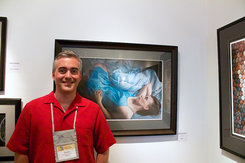
As they begin calling the names, it's a bit like a Survivor episode, with people getting up and leaving the ever dwindling group. Your heart starts racing as the group gets smaller. There were only 6 people left when my name was called, and I received one of the three awards for Outstanding Achievement. Here's the list of winners: http://www.cpsa.org/coloredpencilartists/22/awards2014.html . After the banquet is done, usually there's a bit of an after party at the hotel bar. This particular night there was something special happening at 11:23 pm, though: an Atlas V rocket from launching from Cape Canaveral, and the launch was visible from the beach. Several of us headed out with only the light of our cellphones guiding us, and we saw the rocket rise like an orange flare, lighting up clouds as it passed through them: Saturday morning: Saturday is the trade show, which is great for shopping. Vendors set up a camp, answer questions about their product, and sell their goods usually with a discount. My treat was a tin of Caran d'Ache graphite pencils, and some cool paper called "Stipple paper", which has a bumpy texture that will be fun to experiment with. Saturday afternoon: CPSA provided a bus to shuttle us to the Ormond Memorial Art Museum. The museum is a great, modern space with multiple rooms displaying the show. It quickly becomes packed during the artist's reception, and soon it is a sea of people. The show is hung nicely; some rooms have a fair amount of natural light, while others have picture lights. I find my piece, "Adrift", in a corner adjacent to the best of show piece, "Stone Faced". "Stone Faced" is a really brilliant work, and looks fantastic in person. Multiple times over the course of the reception I see people looking at the piece with their eyes, then looking at it on their camera phone and seeing the portrait emerge from the pattern of colored stones. The artist who drew it, Scott Krohn, received his 5 year Merit Award this year, but this was his first show award: This is a good place to add my thoughts about the award winners:
- If you look at the past 5 years, the CIPPY awards went to: Scott Krohn "Stone Kissed", Holly Siniscal "Starkissed", Liz Guzynski "September Hydrangeas” , CJ Worlein "The Sisters” , Shinji Harada “Grapes in Basket”, and Jeff George "Life and Death"
- I mentally assign two ratings when looking at each piece: one for Technical Excellence (mastery of color pencil medium) and one for Conceptual Excellence (concept, composition, color usage). I will say that, in general, Technical Excellence seems to get works an award, but Conceptual Excellence is what elevates pieces. Think about Jeff George's "Life and Death" (high technical and conceptual excellence) and Scott Krohn's "Stone Kissed", for example. Having seen all of the pieces of the show, photorealism alone is not sufficient.
- As many have pointed out, there is a different juror each year. Arlene Steinberg has twice now had pieces not accepted into the show one year, to be accepted the following year and even win an award. Different jurors have different perceptions, so I recommend trying not to get too hung up on why a piece did or didn't win an award.
While I was wandering around the reception, I bumped into someone who knew my work, but I hadn't met in person before. She commented that she assumed I was a woman, and I mentioned that happens to me often because "Shawn" is a unisex name (I actually dated a "Shawn" once - we joked that we would have identical names if we got married). Interestingly, she said it was because my work was about feeling, and sensitivity. I really appreciated her comments; often people tell me my piece looks like a photo, and although it's a technical compliment, I feel like I've failed a bit when that's the only takeaway. Lastly, here's a short video clip of the artist's reception, to give a bit of flavor. My Facebook page has many pictures from the reception, including many of the artists in front of their award winning pieces, so be sure to check it out for some additional pics.
This Sunday July 6th, 2 pm - 4 pm, is the artist's reception for "The Art of Colored Pencil" group show at the Endless Mountains Council of the Arts. Show runsJuly 6th -July 27th, 2014.
If you missed the Marquis Art and Frame group show earlier this year, this is an opportunity to see the same group of works and artists. My two pieces in the show are "Sunrise" and "The Red Room Revisited". Hope to see you there!

9"H x 12"W colored pencil on Canson Mi-Teintes Touch paper, 2012

15"H x11"W colored pencil on Artspectrum Colourfix paper, 2011
It was 22 years ago, I had a department store job, and I'd just scraped up enough change to make my first big purchase. You remember 1992, right? Cuddled up on the couch watching
or if you were a bit nerdier like me:
$220 was a lot for me at the time, but it bought my first real camera: the Canon T50 SLR. I actually still have it:

T50 Front
It was mostly manual, although it did have a single Program mode on the dial that would provide auto aperture/shutter settings. It came with an FD series 50 mm f1.8 manual focus lens. I took a few good pictures with it. One of the better ones was of my friend Carol, who wanted a portrait taken. Here it is:

Carol
You can see that I always liked mood and light. Being a film camera, you would take a few dozen photos and hope that you got the alchemy right to get the exposure and lighting effect you wanted. There was no post processing (unless you had access to a dark room and wanted to dodge/burn areas literally by hand). Photography was always like buying a bunch of instant Bingo tickets, peeling open the letters one at a time, and hoping one spelled BINGO. Eight years went by, and it was time for an upgrade. Canon's EOS Rebel line had been launched, and the Rebel 2000 was newly released. It looked quite different than my trusty T50:

Rebel 200 Front
The future is here with my 21st century camera! Silver and gray contoured like a starship, and auto functions for everything. Most notably, a built in pop-up flash, autofocus lens, and built in scene modes. Simple 'auto' wasn't enough: you could set your flavor of auto: Portrait, Landscape, Macro, Sports, or Night Shot. Plus, a digital display on the right showing you aperture/shutter/remaining shots:

Rebel 2000 Top
The Rebel 2000 went on my first international trip, snapping pics across Europe It piggybacked in my back pack up the side of the Gunks while rock climbing, and was there to capture the moment when I got stuck on a ledge with two other climbers.
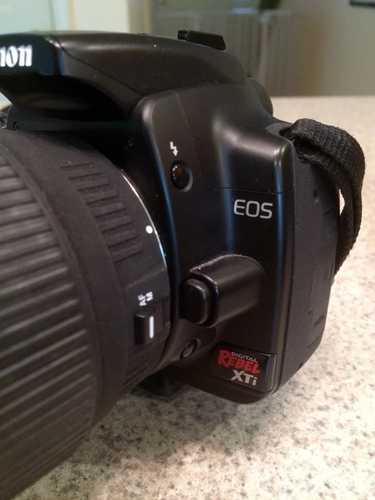
Xti Front

Xti Back
Another 7 years go by, and the world has shifted to digital. I admit I am still enamored with film photography at this point, and reluctant to make the switch, but the instant availability of digital images is such an overwhelming benefit, especially now that I use photography as part of my color pencil process, that I move to the digital version of my film camera, the Rebel Xti: The Xti is serious with it's monotone black color scheme. It retains all of the Rebel 2000 functions, but adds an LCD screen on the back for settings and viewing images: Unlike point and shoot digital cameras, you cannot take pictures with the LCD screen; you must look through the view finder the same as an old school SLR. This is because for the LCD to see anything, the mirror must flip up to expose the sensor (it is an SLR, after all). Another quirk of the sensor is that it is smaller than a 35 mm piece of film, so in effect you get an amplification telephoto effect from your EF lenses. The digital Rebel has a new line of lenses which compensates for the amplification: the EF-S line (fortunately the base EF lenses still fit). Most of my colored pencil artwork started with poses photographed by the Rebel Xti, and nearly all of my pictures of Emma. The biggest ability I've gained is the ability to instantaneously check and adjust exposure for difficultly lit subjects.
So, that brings us to 2014. It's been 7 years since my last upgrade, and I seem to be on a 7 year cycle, so I make the leap the latest Rebel, the Canon Rebel T5i. Considering my first camera was the T50, the T5i almost brings me full circle in camera titles. The T5i has numerous upgrades: more megapixels, more autofocus points, more scene/program modes, but the standout features are:
- HD Video with an articulated LCD that swings out, so you can use it like a hand held video camera
- iPhone-like touch screen with pinch/zoom/swipe gesture control
- Ability to shoot pictures using the LCD (although this bypasses the viewfinder autofocus system and uses the poorer video AF)
- Digital step motor lens with image stabilization (autofocusing is fast and silent for video recording, and the lens senses its own motion and compensates for it to reduce image blur)

Emma's Snack Time

Camera Group
A sample of the T5i's pictures: I'm really amazed by the colors the new camera is able to capture. HD video, which I'd previously been capturing with my iPhone, now has a cinematic quality to it, able to use all of the features (scene modes, depth of field, etc) that are available for stills. I think most colored pencil artists work from photographs, and, by necessity, most learn photography skills. Starting with a photo reference which is poorly or overexposed makes the job of the artist much harder, and starting with an excellent photo helps greatly. Looking at some of the photos from the earlier generation Canons, you can achieve some good results - it's just harder. Colored pencil drawing is hard enough, so making things a little easier on the photography end is welcome! Here's the evolution of the Canon cameras together:
Adrift is all packed up and getting ready to ship to Florida for the CPSA 22nd Annual International Exhibition. This year I did my piece on a full sheet of Canson Mi-Teintes Touch paper, which is a few inches larger than my usual Artspectrum Colourfix paper. When I framed the work, I butted up against the CPSA's size limitation (32" x 40") for the show, coming in at an inch or so under max. 
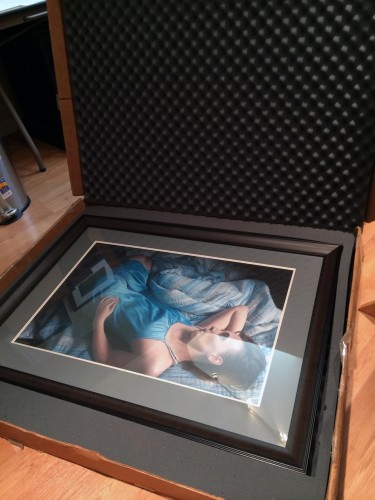 Years ago I bought an Airfloat Systems Strongbox for shipping my work, and looking at how ragged it's become, you can tell I got my money's work. I was a bit nervous that my max size piece wouldn't fit in my Airfloat strongbox, but it just made it with 1" to spare:
  Now I just need to print up my FedEx labels and drop it off at the pickup point down the street, then it's off to the show!
Ah, cheesy puns. My specialty. For those of you who have not had to sit through South Pacific, here's the bit:
In my case, it was 1988, and I was sitting through it from the perspective of the stage. Each year my high school had a musical, and, as someone with the vocal talents of a cat with laryngitis, I was relegated to parts like "man in bar" or "sailor #3". In South Pacific I played a sailor nicknamed "Professor" who had a few speaking lines, but generally lounged on the stage for two hours with the rest of the sailors. I did get to sing "There Is Nothin' Like a Dame", though. Here's a Throwback Thursday worthy snapshot of the ensemble:

South Pacific Ensemble
I'm standing to the right of Stewpot:

Hit the fast forward button 26 years to 2014, and you've got the context for me humming that song as I began cutting the mat for "Adrift" ("There is nothin like a frame, nothin in the world...."). Framing's a much anticipated part of the process where everything hopefully comes together. Usually I order a frame from FramesbyMail with foam board and plexi, cut the mat myself, then do the art mounting, point settings, dust jacket, and hardware. I often struggle when selecting the mat color because my pieces tend to be on darker papers, and white mats are too harsh in contrast. Nonetheless, my first cut at the piece was a black frame, white outer mat, and dark gray inner mat:

Not surprisingly, the white was a bit too stark. The next color tried was "Before Dark":

Better - but the gray was more of a French Gray 70%, which looked brownish. I also wasn't happy with how thin the mat spacing was for the picture size, so finally I broke down and got professional help: I took my work to Marquis Art and Frame to have it professionally framed. This week I got the final framed piece back, and it looks great:

Marquis chose a larger medium dark gray mat with a light gray inner mat. The frame itself is an expresso color with a nice profile:

When we chose the frame and colors, we needed to carefully ensure the dimensions were within the maximum allowed for CPSA shows. The final frame is about 1" away from maximum in both directions (it's a little exciting to have a piece big enough to hit the size limit). If you compare the final product with the first white mat version, you can see the difference having the right mat and frame makes. Now I just need to box it up and get it ready to be shipped for the CPSA show!
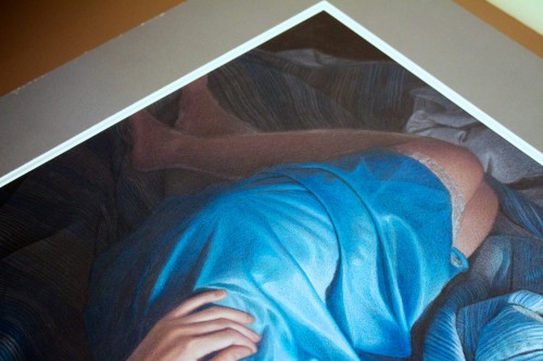
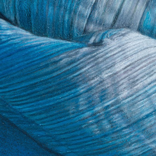
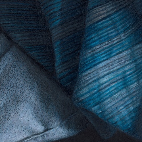
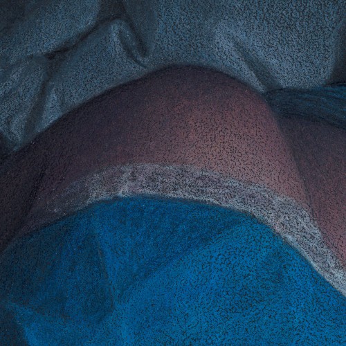
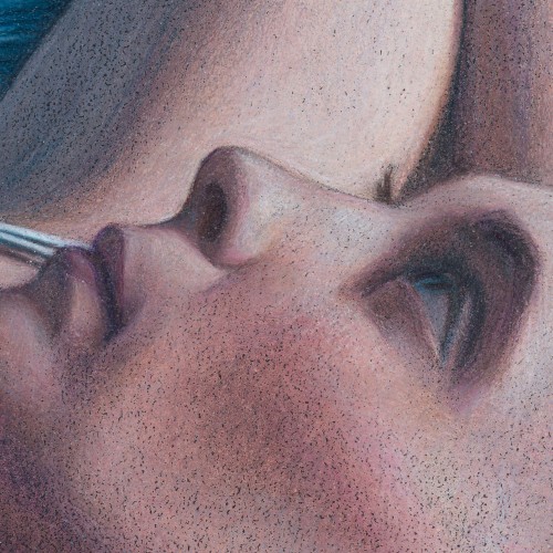
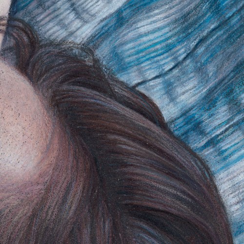
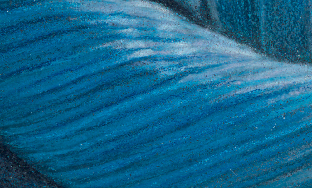
So, if you couldn't guess from the title of this post, it's about....details. A 28" drawing condensed into 6" on a computer screen can look photorealistic, but if you look at it full sized you can see the pencil strokes. I like the pencil strokes (and there were a lot of them in this piece!), so here's a few close ups:

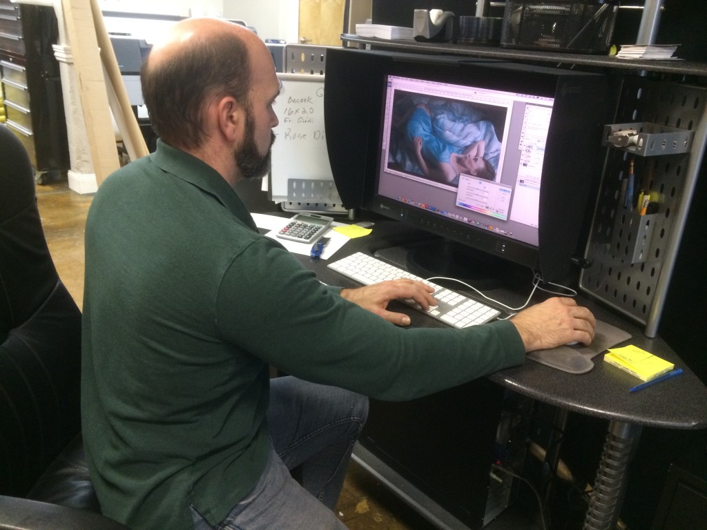
Today was MLK day, and I had the day off from work. My wife and I had a lunch date at Canteen 900, where I had a giant mug of hot chocolate and a multigrain turkey and brie sandwich. Canteen 900 is located in a very artsy, eclectic building, which is very cool to walk around and just explore. One of the things you'll find in your explorations is Lizza Studios, and it's owner, Bob Lizza. Bob has been doing my scans and prints for years. His studio has an incredible, one of a kind scanner which does ultra high resolution reproductions. People literally come from around the world for Lizza's services - Bob has even done work for the Vatican. So, I'm incredibly fortunate to have his studio located 15 minutes from my house. I was expecting to drop off the art, then come back for a few proofs in a week or so. To my surprise, Bob asked if I was free today and said "I can get it done this afternoon." Awesome! I took off for a bit, hit a Barnes and Noble nearby and bought a few cute books for Emma, then returned an hour later. The proof was printed and waiting. I had to stare at it for a few minutes before finding the slightest tweak, then Bob opened up Photoshop and made it quickly, and another proof churned off the printer. It was a perfect match.
Here's a little piece of detail of a small piece of blanket fold from the full size scan:
Bob burned a DVD of the full sized image (400 MB @ 450 dpi), and I'll resize that image to the CPSA's specifications and use it as my entry for this year's show. The deadline for entry is always at the end of March, and it's nice this year to have everything wrapped up early. Now, time to start a new piece!
After a few months of work I put the final coat of fixative on my work in progress, changing it to a completed piece. Final dimensions are 19" H x 28.75" W, Caran d'ache Luminance and Prismacolor colored pencils on Black Canson Mi-Teintes Touch paper. The work's title is "Adrift". Next step is to get a high resolution scan completed by Lizza Studios.