iArt
I just celebrated my 42nd birthday last week, and was thinking back to the pre-internet days of my youth. I remember in college when we were given the option for the first time of writing a paper or creating a webpage. Soon after I marveled as the robotic arm in our engineering lab came alive one night, reached over and grabbed a paintbrush, dipped it into some blue paint, and began painting waves on a nearby canvas. A little webcam taped to it was allowing people to control it over the Internet as part of the PUMA Paint project. People I'd never met from countries I'd never been to were painting pictures in a room that contained only me and a robot. Now, hop into your DeLorean, charge the flux capacitor, and jump to present day. No flying cars, but the Internet is ubiquitous, and it's all about connecting you with people. As an artist, you probably have a blog, a portfolio web page, a personal Facebook page, possibly an artist's Facebook page, an Etsy shop, a Pinterest profile, and maybe a Twitter account. Keeping up with everything can be a challenge.
Ratchet that challenge up to level 2 by thinking about what people are using to read your online media: laptop, iPad, iPhone, Android tablet, Kindle Fire? What looks great on your desktop monitor might be unreadable on a cell phone screen, and your Flash based online gallery won't work at all on an iPad. Since more and more people are surfing the net from tablets and smartphones, it's easy to unintentionally block out some of your audience. I spent the past week fixing this for my sites. Here's the main changes:
Provided an alternative to Flash and touch navigation for tablets:
When Apple launched the iPhone and iPad, they decided to not support Flash. My portfolio web page uses a Flash based program called SlideshowPro to display my artwork. This week I upgraded it to a version which has different galleries depending on what device a visitor is using: a fancy Flash gallery for computer users; a HTML5 touch screen gallery for those with iPads or tablets.
Changed the porfolio web page to resize itself based on the visitor's screen size:
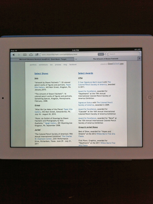
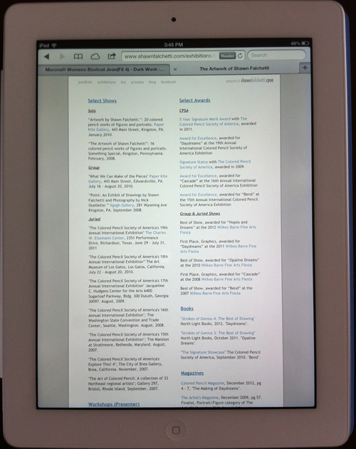
For those savvy to CSS, I changed my page layout and image sizes from fixed to fluid. Everything scales to consistently fit on a viewer's screen regardless of how big or small the screen is. This is particularly handy for iPads and iPhones, which have portrait and landscape modes:
Two small changes, but now everything is iPad/Kindle/smartphone friendly. A little food for thought if you manage your own web pages.


