Shawn Falchetti, CPSA

Blog

The Artwork of Shawn Falchetti
Posts in Works in Progress
It's Hip to be Square

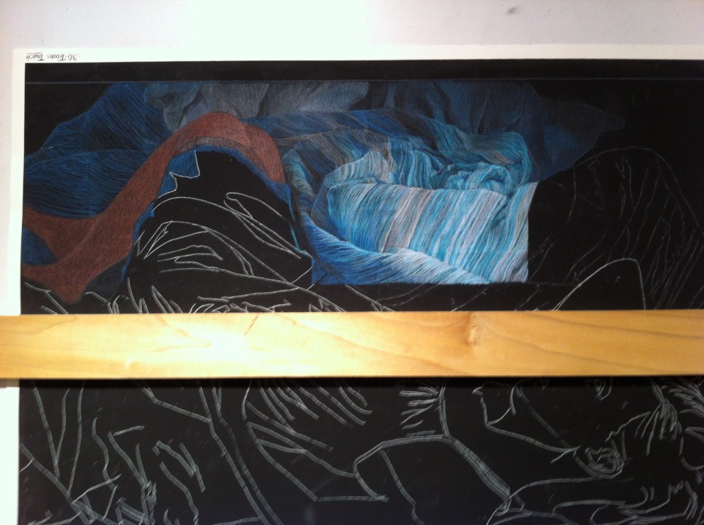
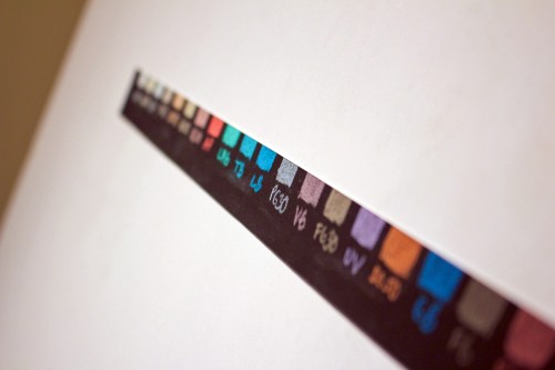
With a few days off for the holidays, I sharpened my pencils and began a new piece.  The cropping is a perfect square (20" x 20"), and I am working on my favorite paper, black Canson Mi-Teintes Touch with Caran d'ache Luminance pencils.  As usual, I started with my swatches: Swatches

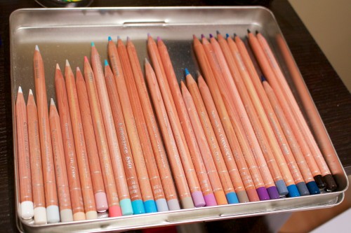
then placed my selected colors into an empty tin to form my working palette:

Pencils

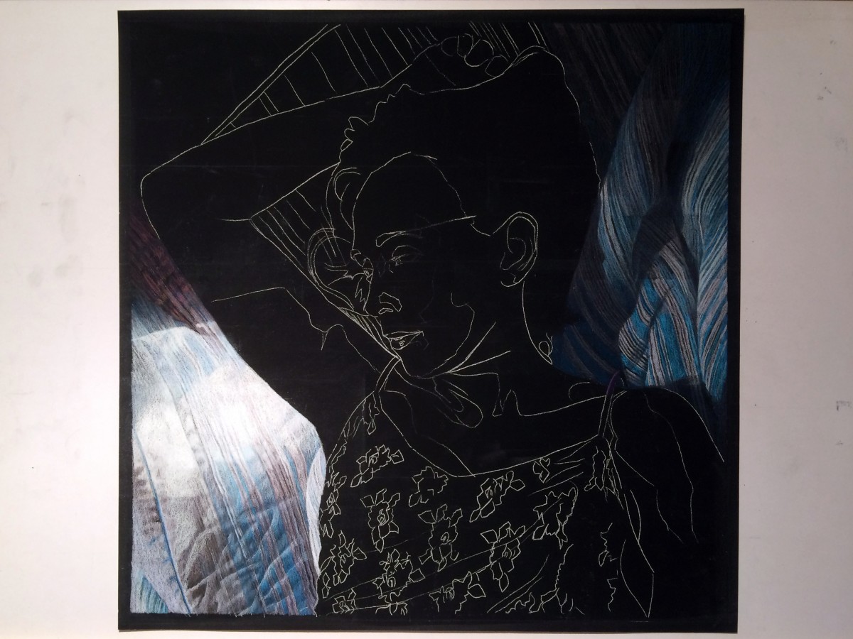
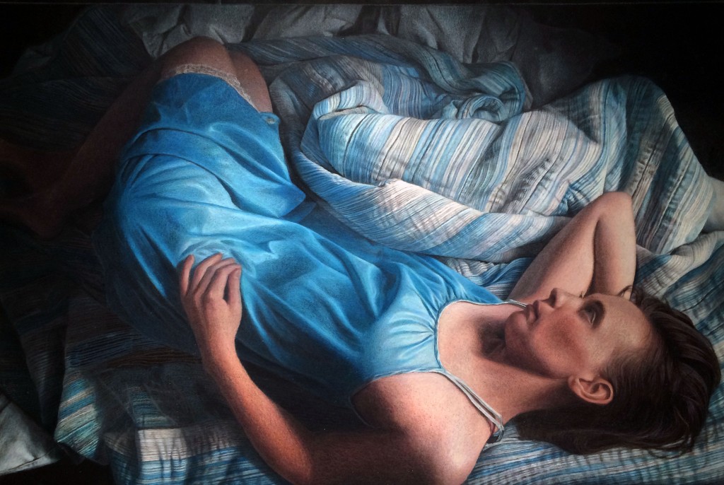
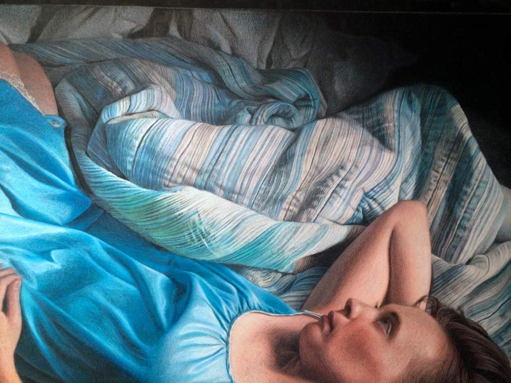
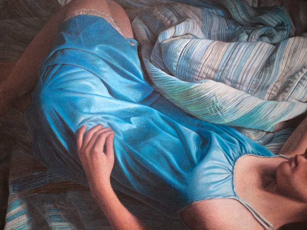
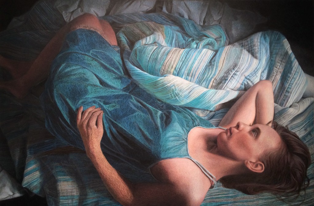
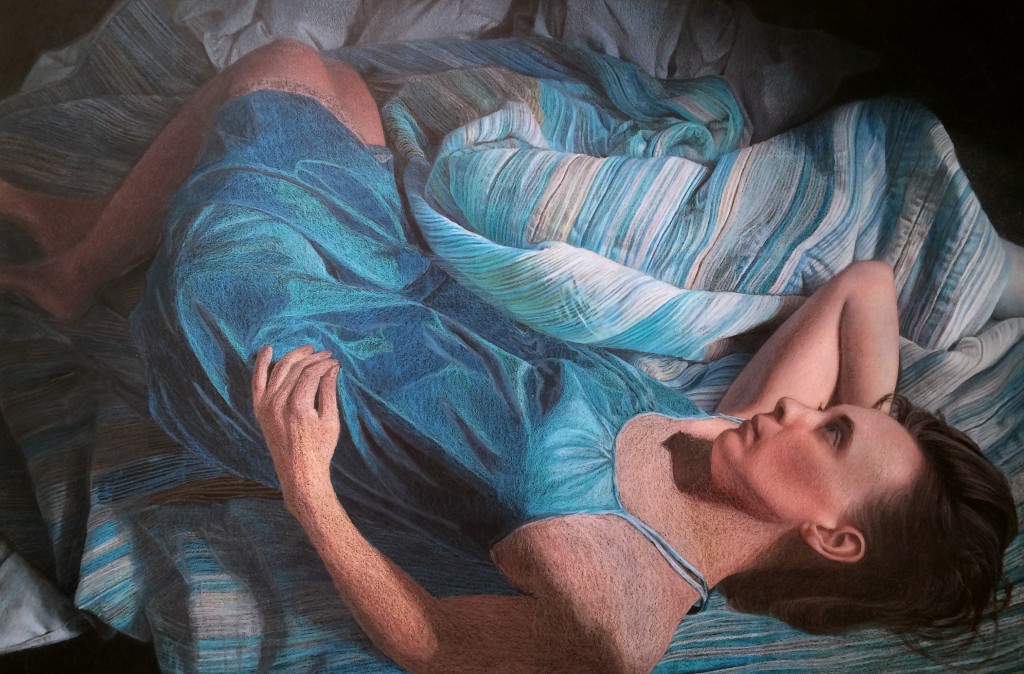
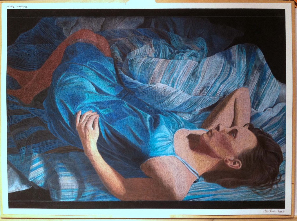
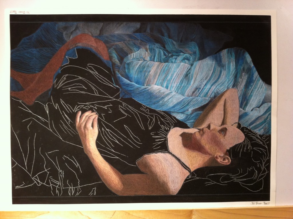
The work is a follow-up to "Adrift", and uses the same blanket pattern, although a different lighting setup.  The blue satin nightgown (which was so much fun to draw) has been replaced with a purple floral lace top (which will be a challenge I'm looking forward to drawing).  I'm about 8 hours into the piece, working on blocking in the blanket details.  The blanket probably looks refined at this picture's resolution, but it is not - if you could zoom in you'd be able to see many areas have solid colors where stripes will need to be added, and other areas that have stripes need their values developed.  After the blanket background is complete roughed in, I'll move onto the skin tones.  In this piece, sunlight is directly falling on the figure's face, so the warm colors should be a nice juxtaposition with all of the cool blanket tones:

WIP Dec 22 2014

Work in Progress - Milestone Reached

Completing a colored pencil drawing can be a bit like running a marathon, and this has been especially true for this one.  Today I hit a milestone, and in honor of it I have a perfect running clip:


One of my favorite parts of that clip is when Clark gets a bit winded and you can just see him realize this seemed much easier in his head, but he pushes past the thought and charges on.

So, here I am at my milestone on the largest and most complex drawing I've done.  The entire work is drawn now and at a fairly high level of refinement.  The next phase is my favorite: balancing color and values, which really adds life to the piece.  I find it fun because the framework is complete, and I can loosen up and more freely put pigment on paper.

A few things on the docket:

  1. Incorporating some blues into the skin tones.  Skin is very reflective and picks up local color.
  2. Incorporating some warms into the blues of the nightgown.  The gown is reflective and picks up the brightly lit skin.
  3. Refining the left arm and hand.  Values still need to be pushed a few steps, and mid tones developed.
  4. Refining the legs in shadow.
  5. Refining the wrinkles in the upper portion of the work.  I learned a lot about drawing the wrinkles as I progressed clockwise, and I'll apply what I learned to the earlier wrinkles.
  6. Refining the hair.  I love drawing hair, and there's always lots of color that can be added.

Here's the work in progress pic:

Work of Progress Jan 2
Work in Progress Dec 30 2013

I've been busily continuing to work the blanket folds and wrinkles, completing the right side and most of the bottom of the drawing.  The bottom left is unworked and will be next.  I'm looking forward to completing the blankets, so I can move on to the overall refining of the piece.  This is a fun phase where I can add color and contrast, really bringing some areas to life. A while ago I wrote a post about color matching, and I caused myself some rework by not following my own rules: I switched photo references.  When I started the piece, my reference was printed on my home printer, which tends to skew colors towards green.  Later I had a full sized reference printed through Apple's Aperture print service, which had colors true to my color calibrated monitor.  Since I had drawn many of the top blankets using the first reference, they were skewed towards green  Using an electric eraser I was able to lift some of the green areas, but the blankets closest to the figure needed to be completely stripped off with the eraser and redrawn.  Now that it's complete, I'll return to focusing on the bottom left side of the drawing.

Work in Progress 12 30 2013

Work in Progress - Dec 24 2013

Happy Holidays!  I've been taking some of my vacation time around the holidays to continue refining my work in progress.  I've been steadily moving from right to left in the upper blanket folds, fixing mistakes and adding detail.  Sometimes it feels like I'll never finish the blanket folds, pattern, and wrinkles - there's so much detail and it's slow, meticulous work, but I think it's really starting to shape up.  Next I'll begin working clockwise to refine the blanket folds until I'm working in the shadow areas of the piece. Blanket Detail

Nightgown Detail

Work in Progress - November 27 2013

Another 7 hours of work today, filling in more flesh tones and continuing to refine the blanket near the elbow.  As I've been moving from right to left, I've been correcting both the pattern, value, and in many cases the color of my first pass.  With the values refined for the right-most blanket and the arm and face skin tones, you can get a sense of the strong light direction from the upper right, and how the left side of the picture will unfold IMG_2817

Work in Progress - November 26 2013

Several more hours of work, and I've begun refining some of the blanket folds, working all around the piece before moving into some fine detail on the right side of the blanket. I have to admit, at times I feel a little over my head working the blanket pattern, and I just need to take a break from it. During those breaks I've started working the skin tones for the legs, right arm, and head. I'd just like to say that I love the Caran d'ache pencils for skin tones, mainly because several of their colors are skin tones, and you don't need to create them using the familiar pink-orange-yellow layering. It certainly speeds up things. Now that I've put the Caran d'ache through their paces, here's a few observations:

Caran d'ache Luminance pencils (76 color tin):

  • Superb quality control.  All leads perfectly centered, pencils sharpen well, points don't snap.
  • Pencil diameter is slightly larger than standard.  If you have an adjustable pencil sharpener, no problem (on mine it is one click bigger than standard).  On my old Xacto sharpener, which was not adjustable, I couldn't fit the pencils in without jamming them with force.
  • Pigment feels "drier/more powdery" when applied, especially to sanded paper.  It lays down evenly.  "Less waxy" is perhaps more accurate.  Leads feel harder than Prismas, but not as hard as Prisma Verithins.
  • Different colors have different hardness/waxiness.  This is the case for all colored pencils I've used, regardless of brand.  You just get to know the feel of different colors.
  • Expensive!  Okay, I knew that before starting, but yikes!  I'm on my fourth refill of some colors already for this picture, at $4.03 per pencil open stock
  • A bit hard to reorder.  No one sells them locally, and even ordering them online via Dick Blick periodically has colors out of stock, which can bring working on a piece to a standstill
  • Colors in the 76 pencil set were well chosen and compliment each other nicely.  You could almost grab random colors from the set and still have a nice color harmony, because the colors are a bit subdued.  The set is very heavy in blues, grays, and fleshtones, so it is perfect for me.  It's a bit sparse on greens and reds, though.  I feel I'd need to supplement the set with other brand's pencils if I were working with those two colors.

Here's a snapshot of the work in progress. My next steps are to finish the skin tones on the upper body, and continue refining the upper blanket folds moving right to left.

Work in Progress November 26

Work in Progress – Oct 6 2013

I've got the main colors blocked in for the entire piece, and I've really been grinding through pencils.  I already placed another order for some of the turquoise colors, which will arrive later this week.  There's a few shadow areas with bare black paper showing on the left, but the pattern is penciled in.  This entire area of the picture will be much darker than it is now and I realized I was probably going to end up stripping off some pigment if I blocked it in solid now, so I'll wait until the other values are refined before working this area. It's a bit of a relief having all of the folds and pattern stripes mapped out.  This will let me focus on filling in the colors and values next.

IMG_2656

Work in Progress - Oct 1 2013

Today I put another 7 hours of work into my current project. I was surprised yesterday how quickly I went through my first few pencils. I'm used to the sanded papers really devouring my pencils, but I had somewhat underestimated the usage of the bedspread colors, and in no time I was down to pencil stubs. In fairness, the paper width is 28.75″, and the same four colors have been used constantly. Since they are Caran d'ache Luminance, no one sells them open stock locally, so I had to order them from Dick Blick. This also meant that, today, when I used up my last stroke of blue, I needed to switch gears and focus on a different part of the picture until my order arrives. I decided to block in the base colors for the fleshtones: IMG_2643

One of the other quirks of being home today is that it was just me and the cat, Iggly. There's a series of cartoons called "Simon's Cat" that any cat owner will love, and this one sums up trying to do artwork with a cat:

[embed]http://youtu.be/uOHvZjiDANg[/embed]

Work in Progress - Sep 30 2013

A while ago I wrote a post about selecting a palette for my next piece, which will be completed on a full sized sheet of Canon Mi-Teintes Touch black paper using Caran d'ache Luminance pencils.  The palette looks like this: final palette

I'd previously transferred the line drawing and had the picture mounted on my drawing board ready to go.  Today I got a few hours to put pigment to paper.  Usually I work all areas of a piece at once, progressing through basic colors and shapes to more refined details, saving elements like patterns or lace for last.  For this piece, though, nearly the entire work is a pattern, so I am working the pattern as I go along, section by section.  Non-pattern areas are getting basic value and colors blocked in at this stage, and once I have the entire piece blocked in I will begin refining and building up the colors layers.

The pattern is a wonderful challenge, along with all of the fabric folds, but it's also a bit like drawing hair: what's important is the direction and framework be in place; the rest I can draw in during refinement.  The shadow areas, for example, are single lines on bare black paper.  The highlight areas are fairly refined, but this is a focus area which will influence value choices for the figure, so I worked ahead on this section some to figure out some color and value combos.

IMG_2641

Work in Progress - Feb 6

This weekend I turned a corner on the picture, and hit the point where everything is drawn and I can focus on pushing in color and building value.  The pattern on the pillow is still giving me trouble, but strangely the pattern in the sheets is coming together on its own.  I decided to hit the piece with a layer of fixative before continuing work early today, because it was getting pretty waxy and difficult to see how dark some areas were.  I'm always a little nervous about doing that too early, because the paper becomes slicker overall, but it seemed to work okay.  I also encountered the usual paradox where my darks didn't seem dark enough, but in actuality I needed to make all of my lights lighter.

Work in Progress - Jan 30

Slow going, but steady progress.  The pattern in the sheet is going to drive my bonkers, but I feel the angles and lines it makes really add to the movement of the composition.  I think I'm happiest with how the hand turned out - I was worried about the foreshortened hand being front and center, but that part went actually surprisingly easily.  The lower right hand portion of the picture still has the least amount of work done, just with blocking and a few glazes of jade green to color correct.  You can see the pattern of wrinkles in the sheets starting to form.

Work in Progress - Jan 23

I've been working steadily on the piece that I prepared the swatches for in one of my previous posts.  The finished piece will be a panoramic 26" w x 12" H on Aubergine Colourfix paper.  If it turns out well, it will be one of my submissions for this year's CPSA show.  I love to draw twists, turns, and folds in fabric, and this piece has plenty of it!  Most of my work so far has been on the figure, and with different stages of blocking in for the fabric. On the flat portion of the sheet on the right there's just basic geometric shapes right now where the wrinkles and shadows are, but the crumpled comforter is fully blocked in and has some initial refinements, and I've started adding details closest to the figure.

Getting Started - Swatches

I'm just getting underway on a new piece.  It has an interesting panoramic crop, which is somewhat different for me, with a final planned size of 26" W x 12" H.  I'll be working on my favorite paper, Colourfix, in a color that I haven't used much: Aubergine (usually I work on Storm Blue or Fresh Gray). The first step is always to pick my palette, and I like to do this by laying down swatches of color on scraps of the actual paper I'll be using.  I'll then keep this beside the picture throughout the process for reference.  Once I have the swatches, I'll whittle them down to a dozen or so colors and place those colored pencils into a working tray.  Sometimes I use an empty Prismacolor tin as my pencil caddy.

Here's a scan of my swatches for this piece.  They're organized by color groups, and within each color group by values.  It's also nice to see all of the colors together to get a feeling of the overall color harmony.  I'll post more work in progress pics as the piece moves along.


Finished - 4/21

Finished!  Time to complete was 9 days, probably around 30 hours.  After coating the piece with fixative, and letting it dry, I did some color correction throughout, and then final detail work.  I always try to avoid using black until the very end; it's my trump card for values, and once I play it, I can't go any darker.  You can see how the hair has more definition from where the blacks were introduced.  I'm happy with how it turned out - I really wanted something softer, which worked with the waxiness of the Neocolors, to have a more painterly feel to it.  Now I just need to mat it with a backing and place it into a plastic sleeve.  If you like it, you can bid on it at the CPSA Silent Auction, which is July 29th at the 18th Annual International Exhibition in Santa Clara, California.

Here's the progression side by side:

Work in Progress Update - 4/19

Picking up some steam, now.  There's a point in every drawing where the hardest parts are done, and you get to play with colors and details.  Feels like I've reached it with this update.  Started to refine the lace, although there's still a lot of color correcting to do there, and some detail work.  Looking forward to dabbling on Tuesday (although it will be competing with my Lost addiction, so I probably won't be as productive!)

Work in Progress Update - 4/18

A couple of hours Friday and Sunday working on color balancing, especially the skin tones, and further refining the face and hair.  Haven't done much yet with the lace - but that will be last so I don't have to rework it several times for color and value balancing.  Starting to come together.  More updates to come later in the week.

Work in Progress - Update 4/16

Still figuring out what I'm doing with Neocolors.  I decided to do a second wash for a few parts, and discovered (unfortunately) that the first wash will come off when rewet.  I completely erased the left arm, as well as some of the darks in the dress!  After some struggling I've fixed the oops, and have been working on getting the values and colors in the skin tones correct.  I find it very difficult to force colors into light Colourfix paper  - I tend to work with dark tones because of this.  Since this piece is on a lighter tone, it's been a wrestling match.  The dress has been the biggest struggle.  Overall it's still on track though - still plenty of color correcting and value building to do.  I haven't done much yet with the lace of the dress, but I'll work on the details once I get the values and color balance worked out.